
User interface creative has evolved.
It’s no longer just:
“See? We have that, too.”
Don’t just get settle for being represented accurately.
Make sure they’re convinced you’re better than they expect.
When you need to convince someone of your message, you do a bang-up job. Everyone who is passionate about their mission does; communicating in a compelling way is a sign of a truly great enterprise. It’s the “factor X” to business success. It’s that lightning-in-a-bottle asset. It’s often the first thing to be forgotten on your website.
Websites and user interfaces are a vital extension of your brand message, and obviously a vital tool in your marketing strategy. Yet it’s surprising how often people get stuck in that old-fashioned, fuddy-duddy regard for their website, and consider “just having one” as “good enough.” Bland creative content on a web interface is one of the most common wastes of resources, which is why so many of them fail to deliver interest, engagement, or sales.
You read correctly: the key to a website’s success is the creative. But that means a lot more than just flashy headlines and cool images (although those are pretty important too). The success of a user interface lies the messaging, branding, and how information is organized to compel an audience towards your enterprise. It needs to be emotionally evocative enough to gain audience conviction.
However, “emotionally evocative” stuff isn’t always radical and weird. (Although sometimes it can be if the project calls for it.) There are ways to be professionally conservative and still be emotionally engaged engaged with your audience. There are ways to be respectful and proper and still retain emotional connection with your audience. Regardless of your unique tone and voice, the job of all this emotion within your creative interface remains the same: to compel your audience to do the thing, sign up for the mission, or buy the stuff.
Don’t just settle for “having a website.” Make sure your interface greets users with messaging and tone that maintains and affirms their expectations, while deepening their conviction towards that golden goal of “sales conversion.”
In plain speak: let’s make sure your website or UI compels them to love you more.
Web & UI Portfolio.
Browse some of our favorite web interface branding projects.

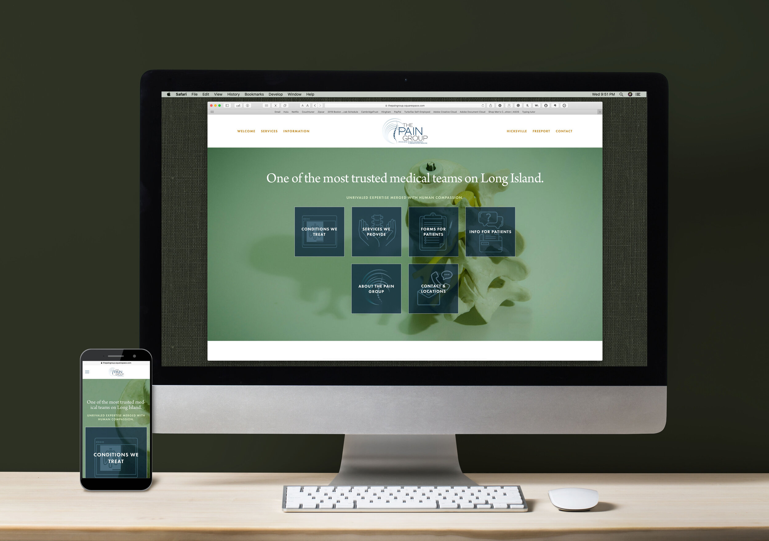
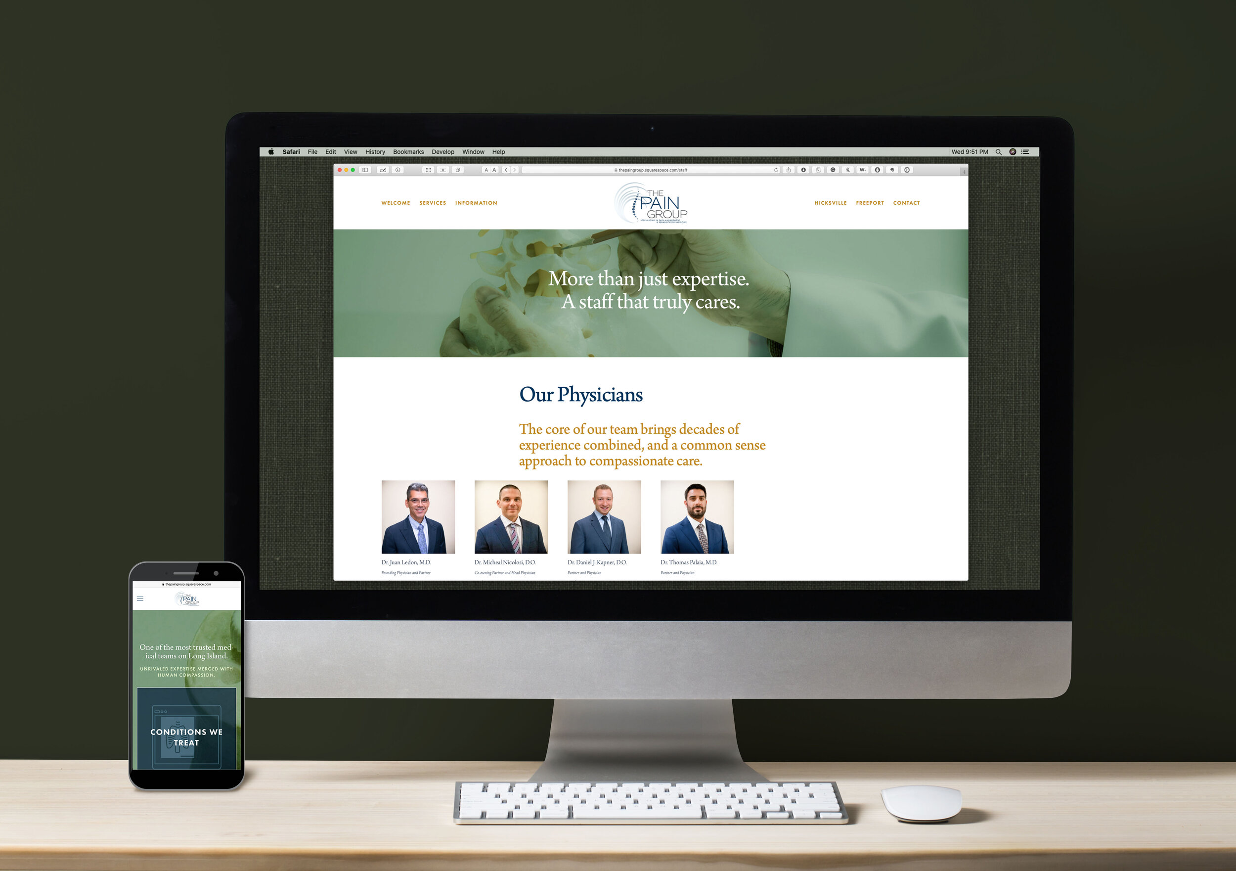
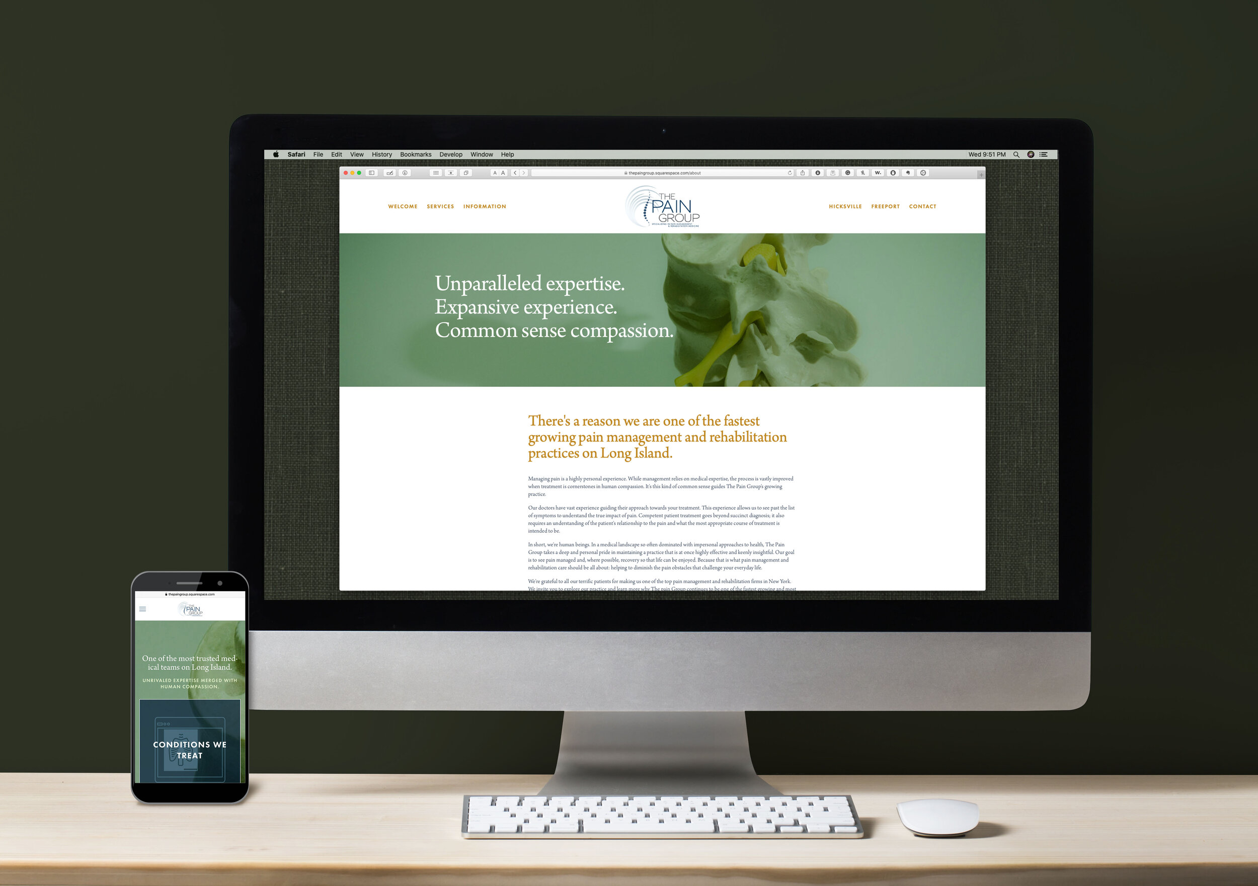
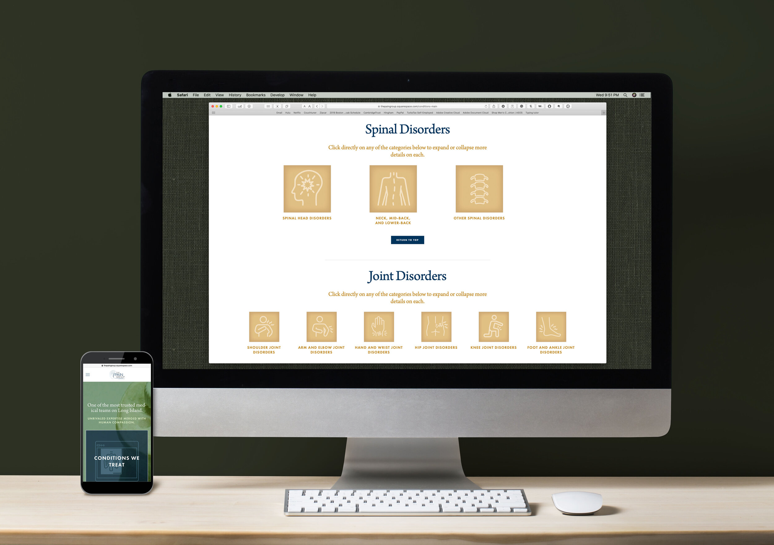
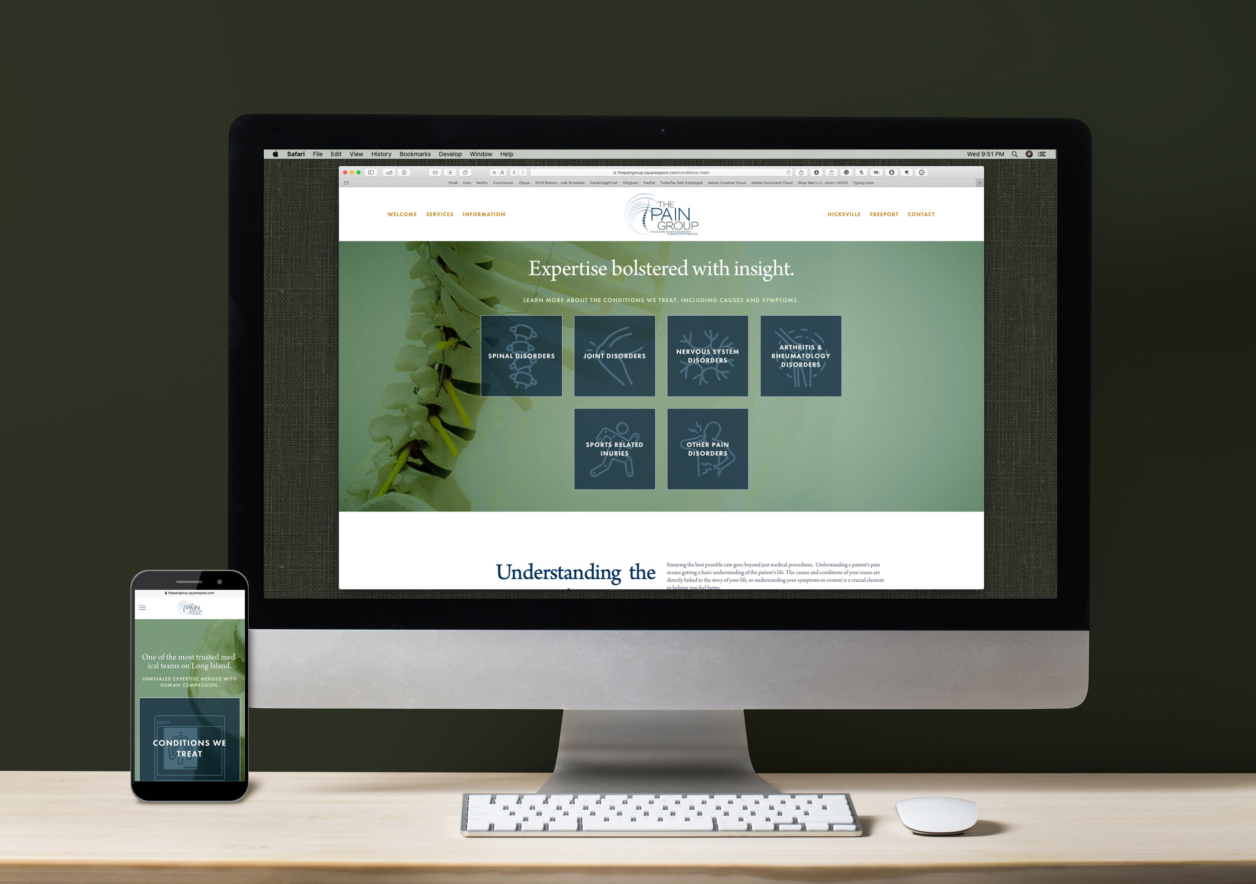
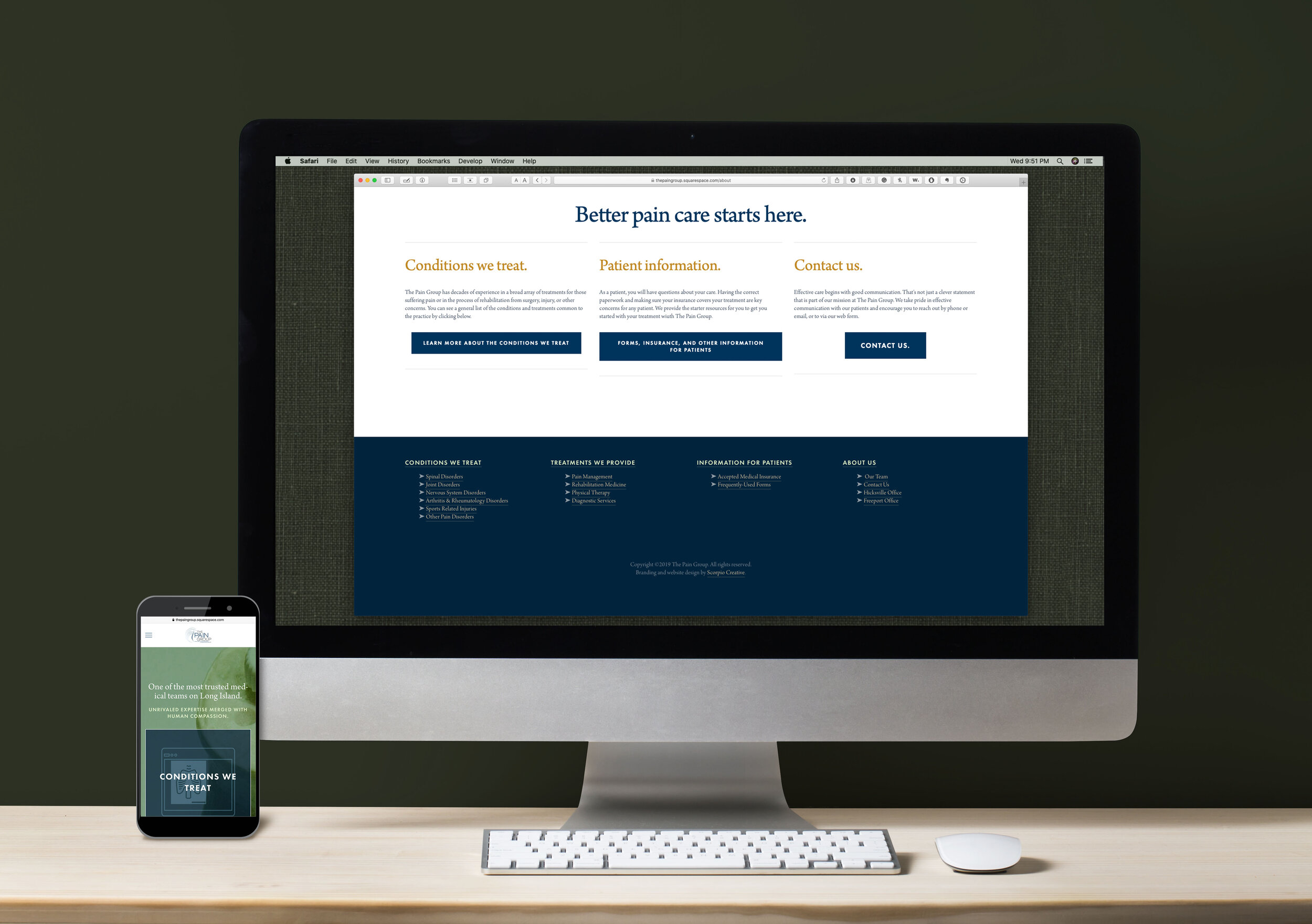
The Pain Group Website
A growing orthotic medicine group was expanding. More physicians, more services, and more locations means more branding. This project brought The Pain Group to a current state while preparing them for growth down the road.
Work included extensive research and education on the business, original graphics, on-site photoshoot, brand standardization, iconographic development, copywriting, information management, HTML & CSS, SEO optimization, and other production.
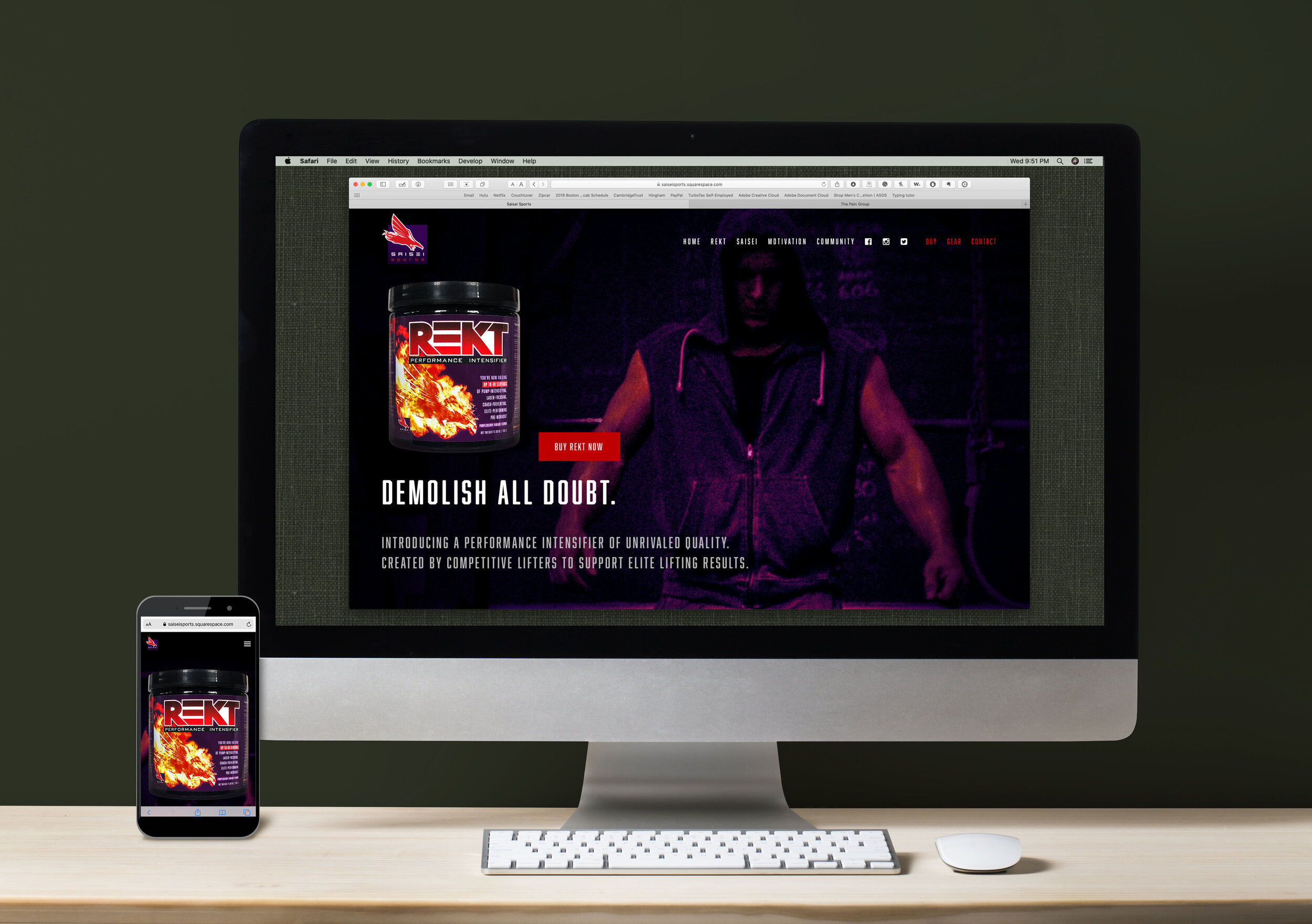
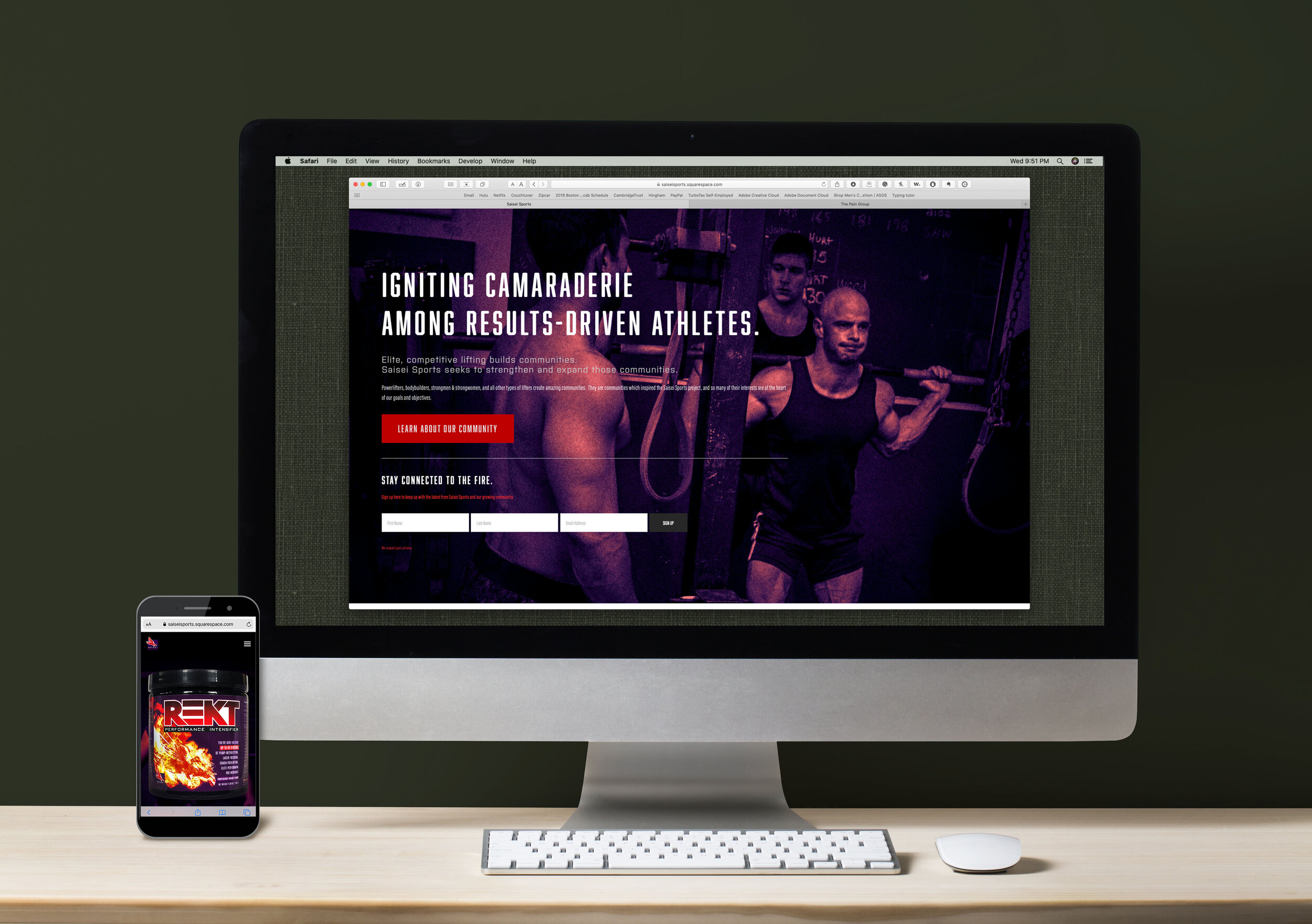
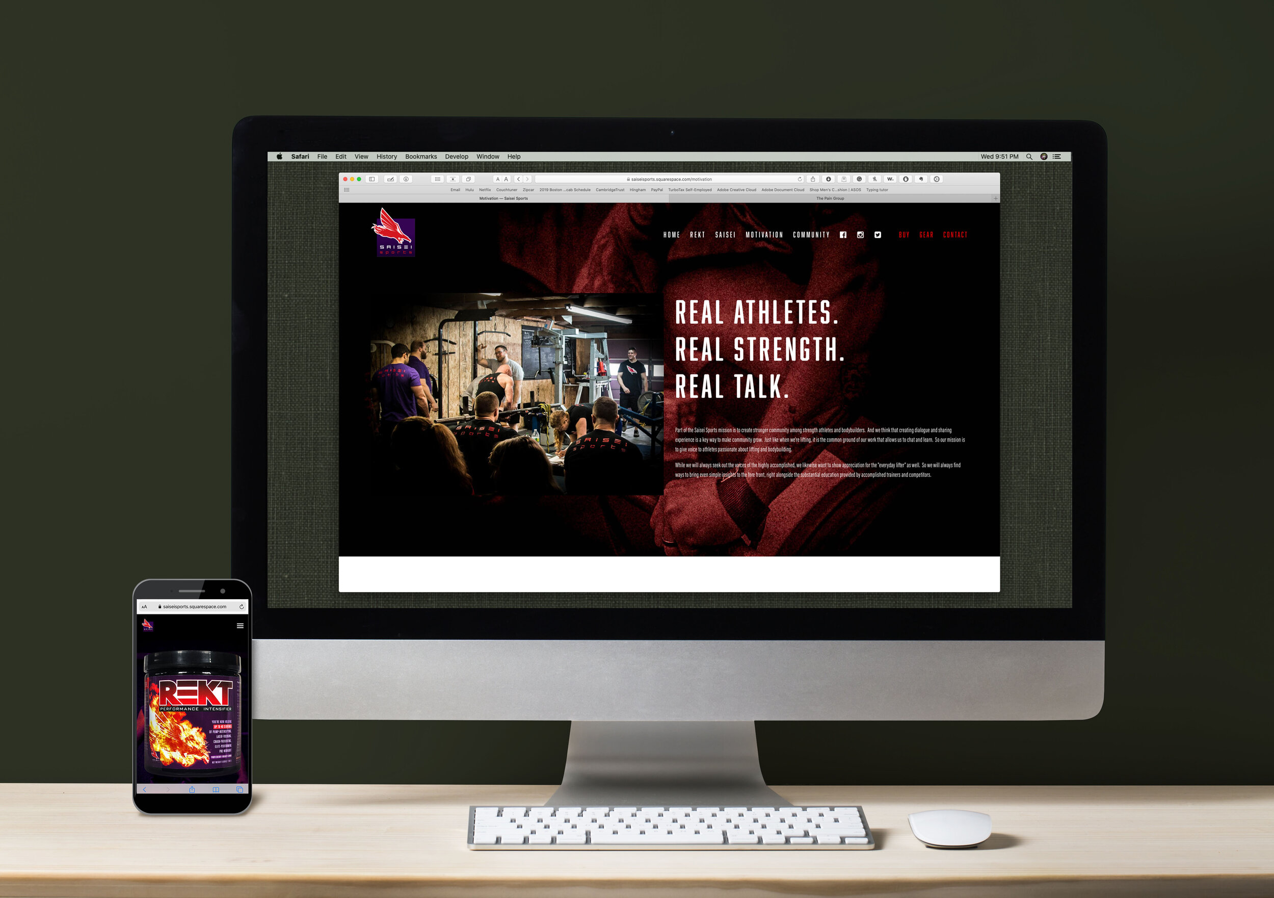
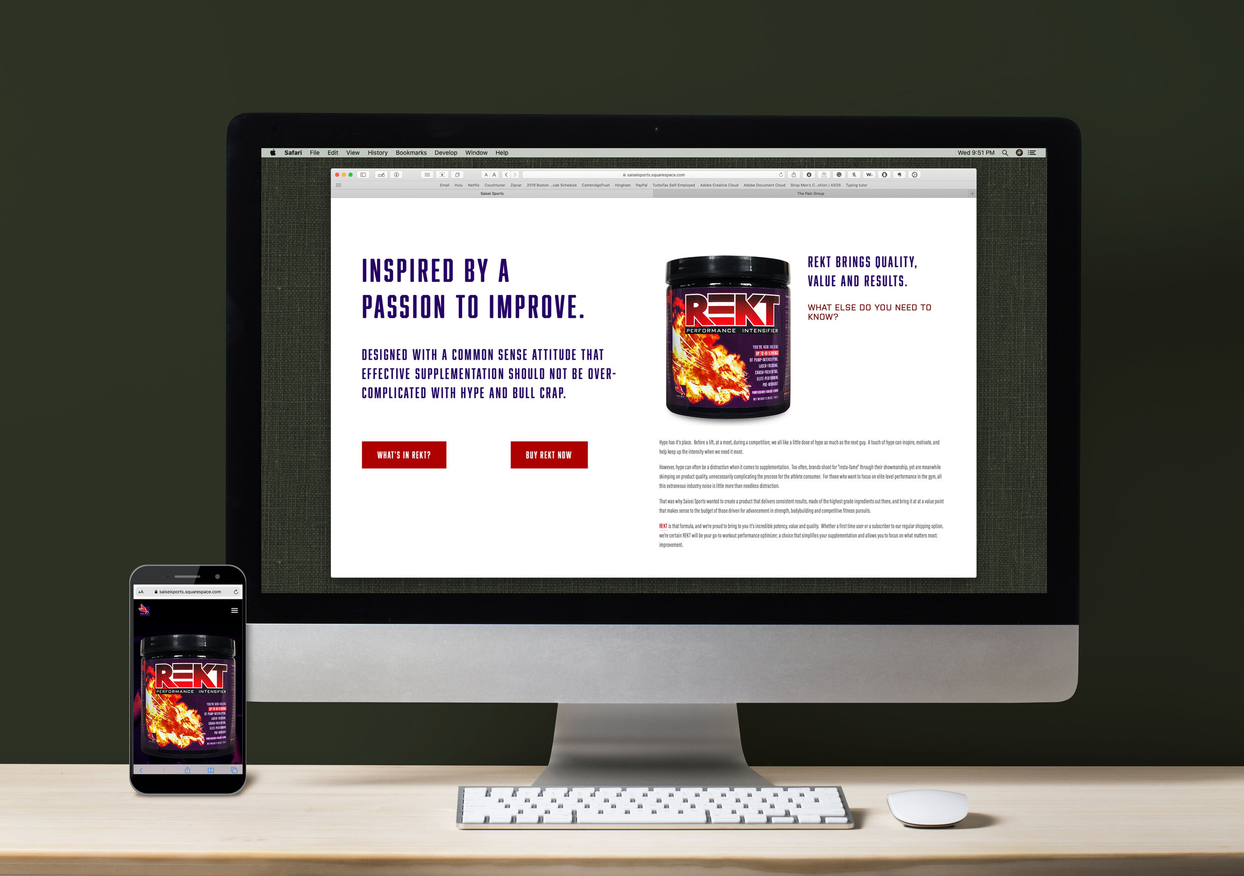
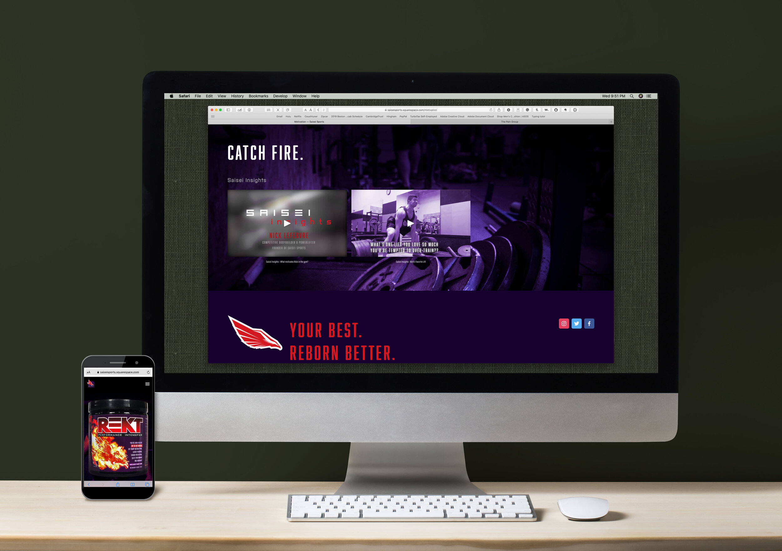
Saisei Sports Website
Seeking to get their startup off to a strong launch, Saisei Sports needed a full commerce website that stayed within budgetary constraints. Capturing the mood and pathos of the owners helped evolve a commerce solution that continues to gather their community.
Work included marketing strategy, original graphics, on-site photoshoot, brand standardization, e-commerce development, iconographic development, copywriting, information management, HTML & CSS, SEO optimization, and other production.
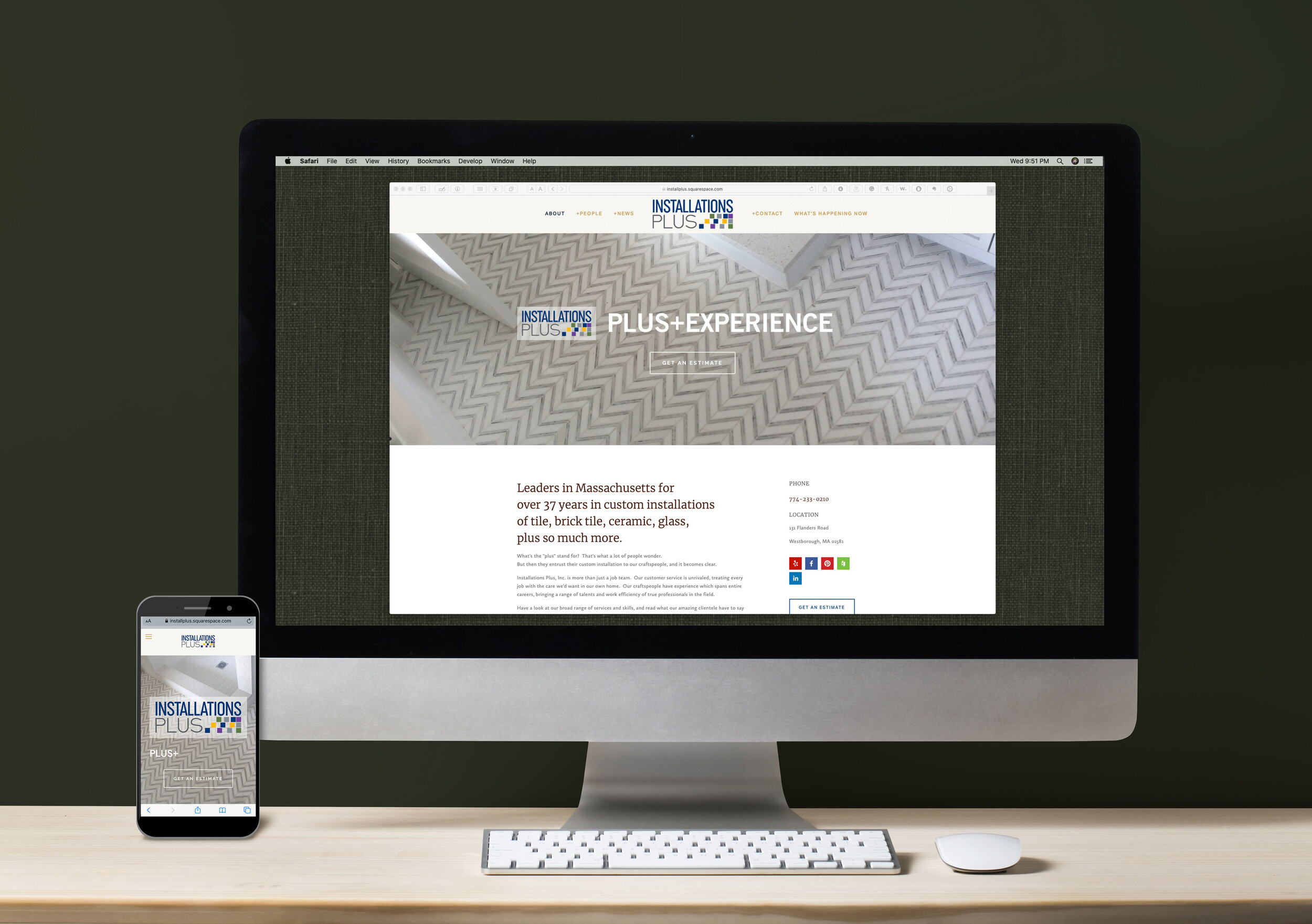
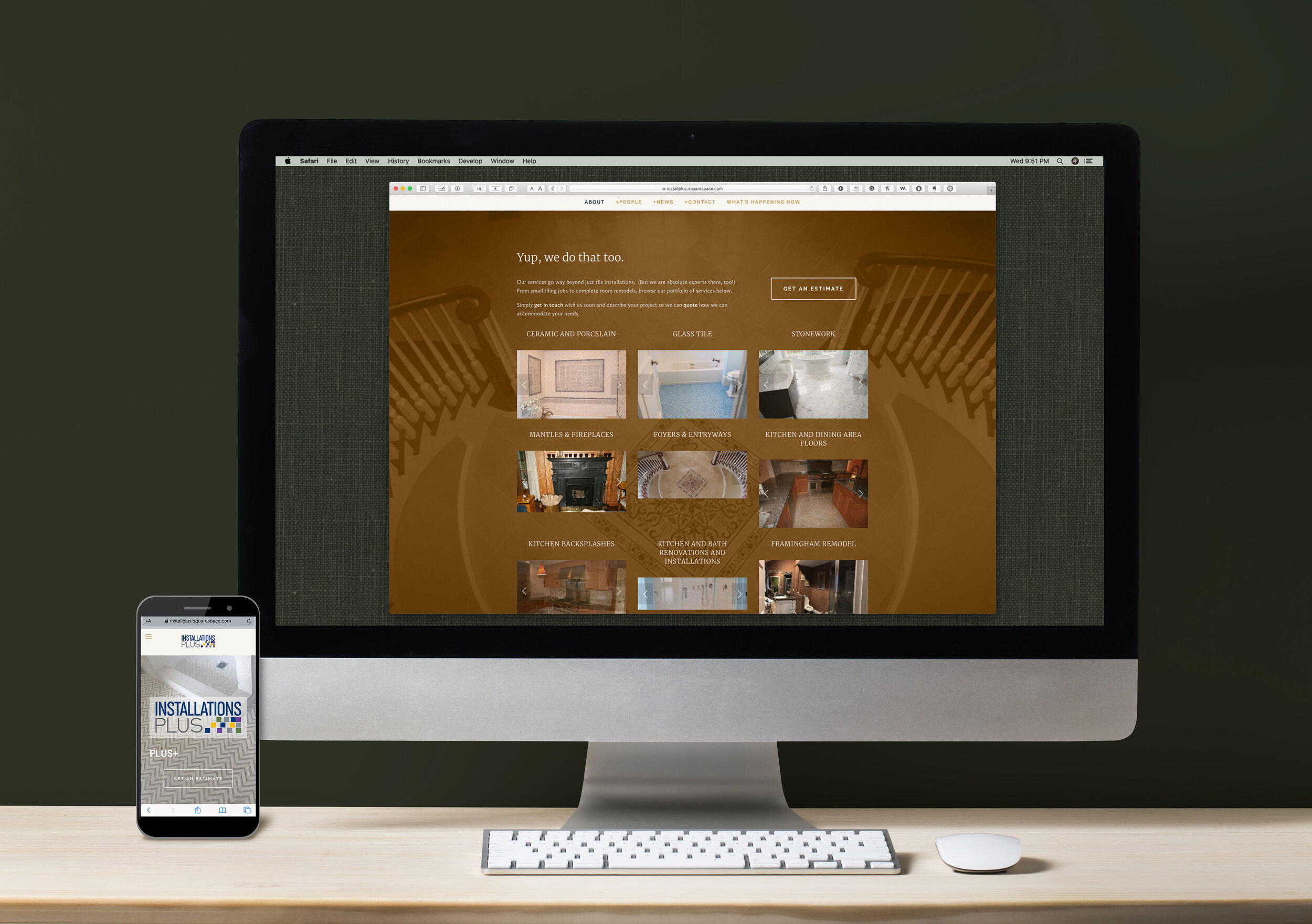
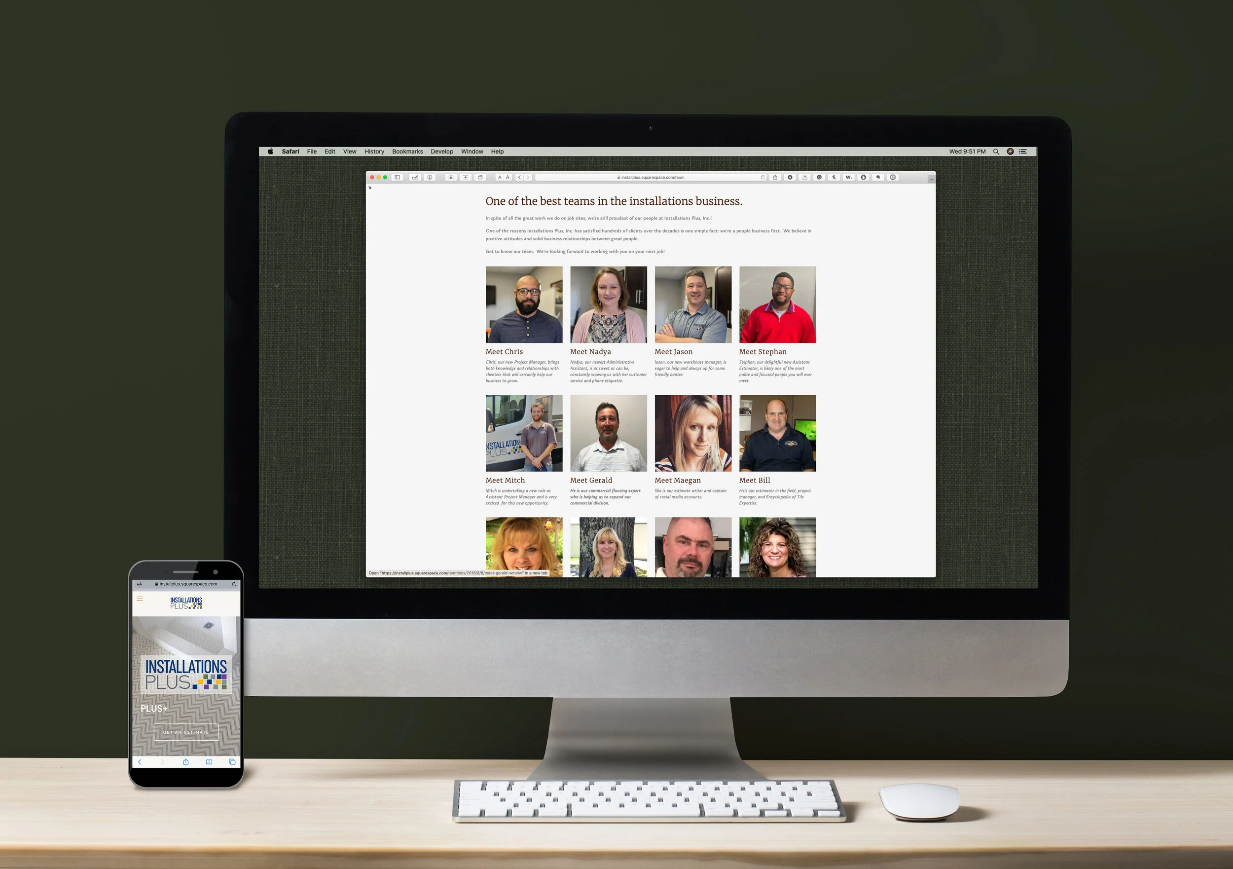
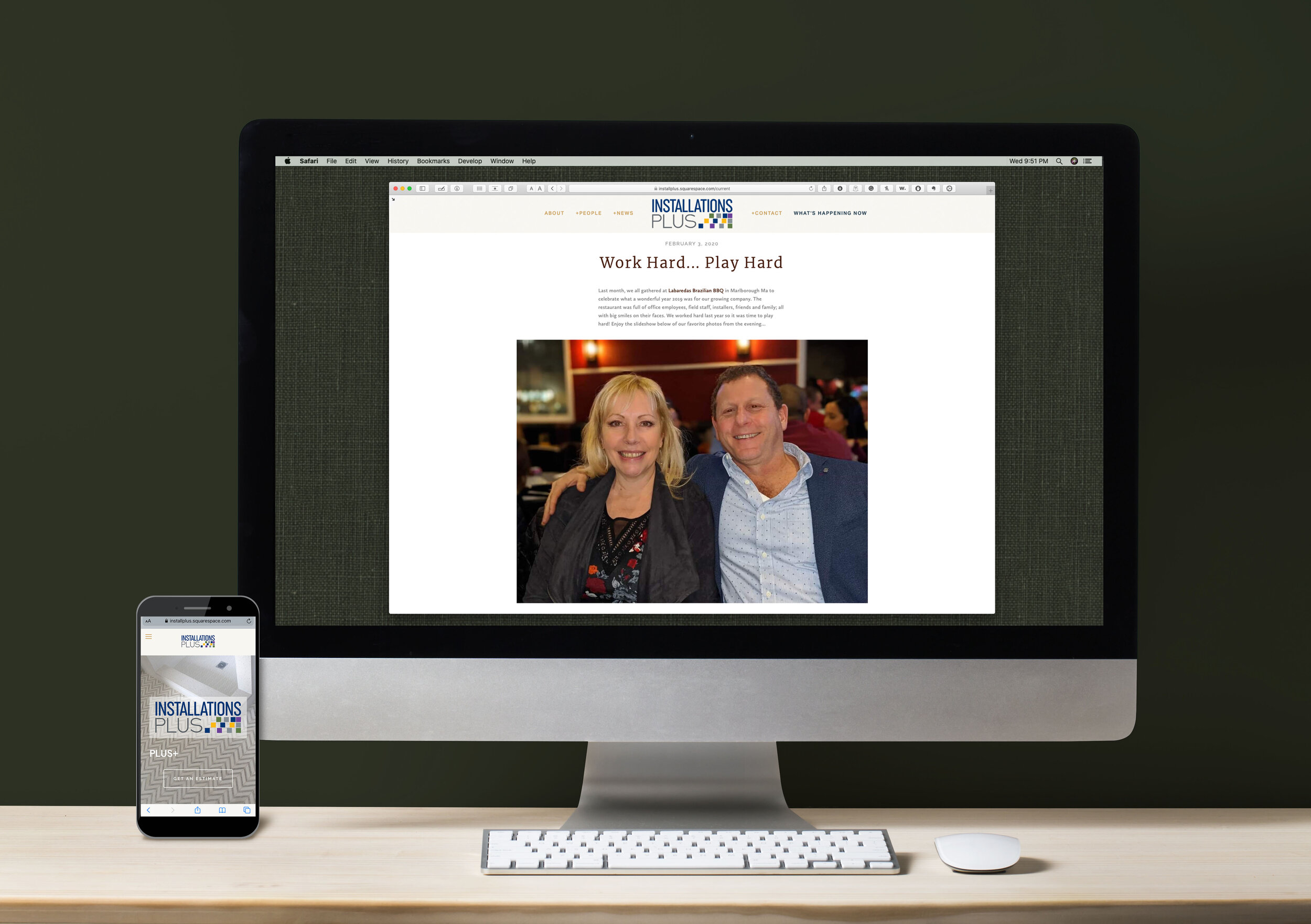
Installations Plus Website
In business for decades, Installations Plus greatest marketing advantage is an incredible record of client satisfaction, which led to incredible word-of-mouth business generation. Their site needed to be modernized, showcasing their services, yet maintain a strong identity as everyday people who their clientele was familiar with.
Work included original graphics, photo retouch and compositing, brand standardization, copywriting, information management, HTML & CSS, SEO optimization, client education, and other production.
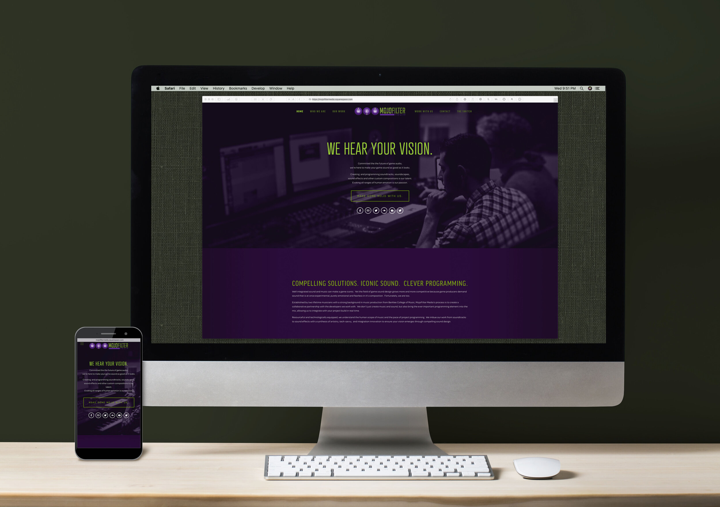
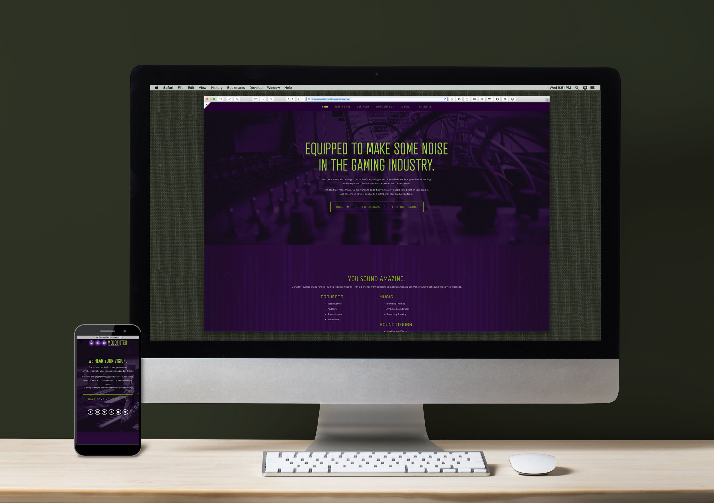
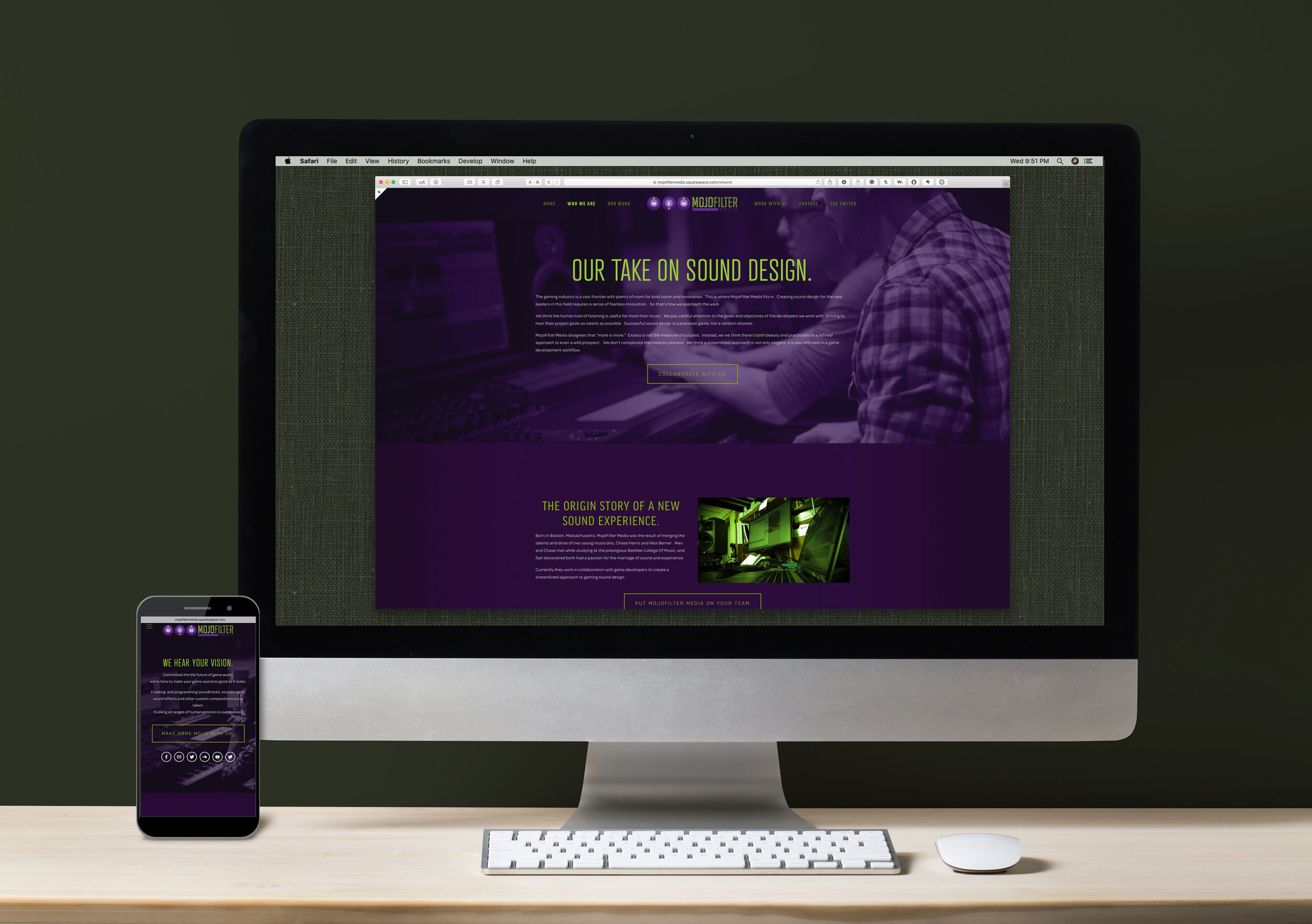
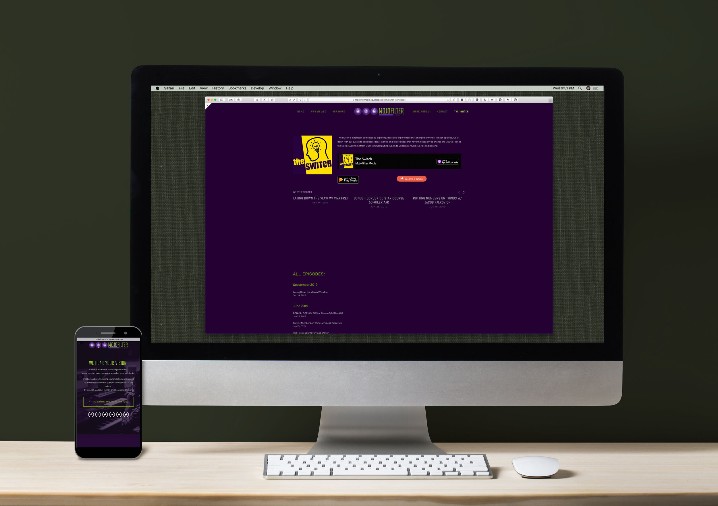
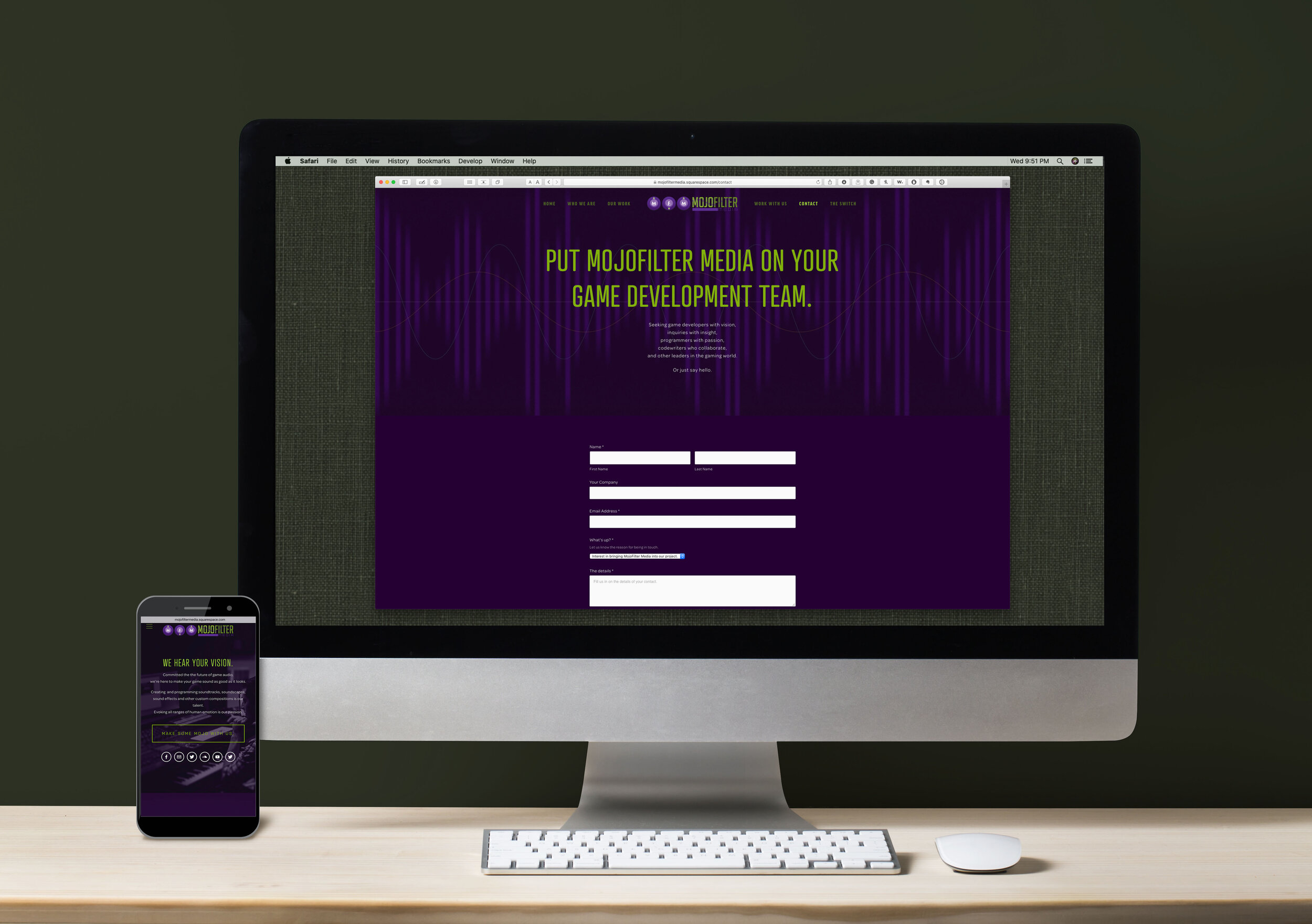
MOJOFILTER MEDIA WEBSITE
Sound designers focusing on the video game sector needed a site that married themes and emotions of their niche while still focusing on their unique and individualized skill sets and talents. A site that allows them to showcase their audio talents, portfolio, and podcast while still having a fascinating and evocative graphic theme hit their high score.
Work included original graphics, photo retouch and compositing, brand standardization, copywriting, information management, HTML & CSS, SEO optimization, client education, and other production.
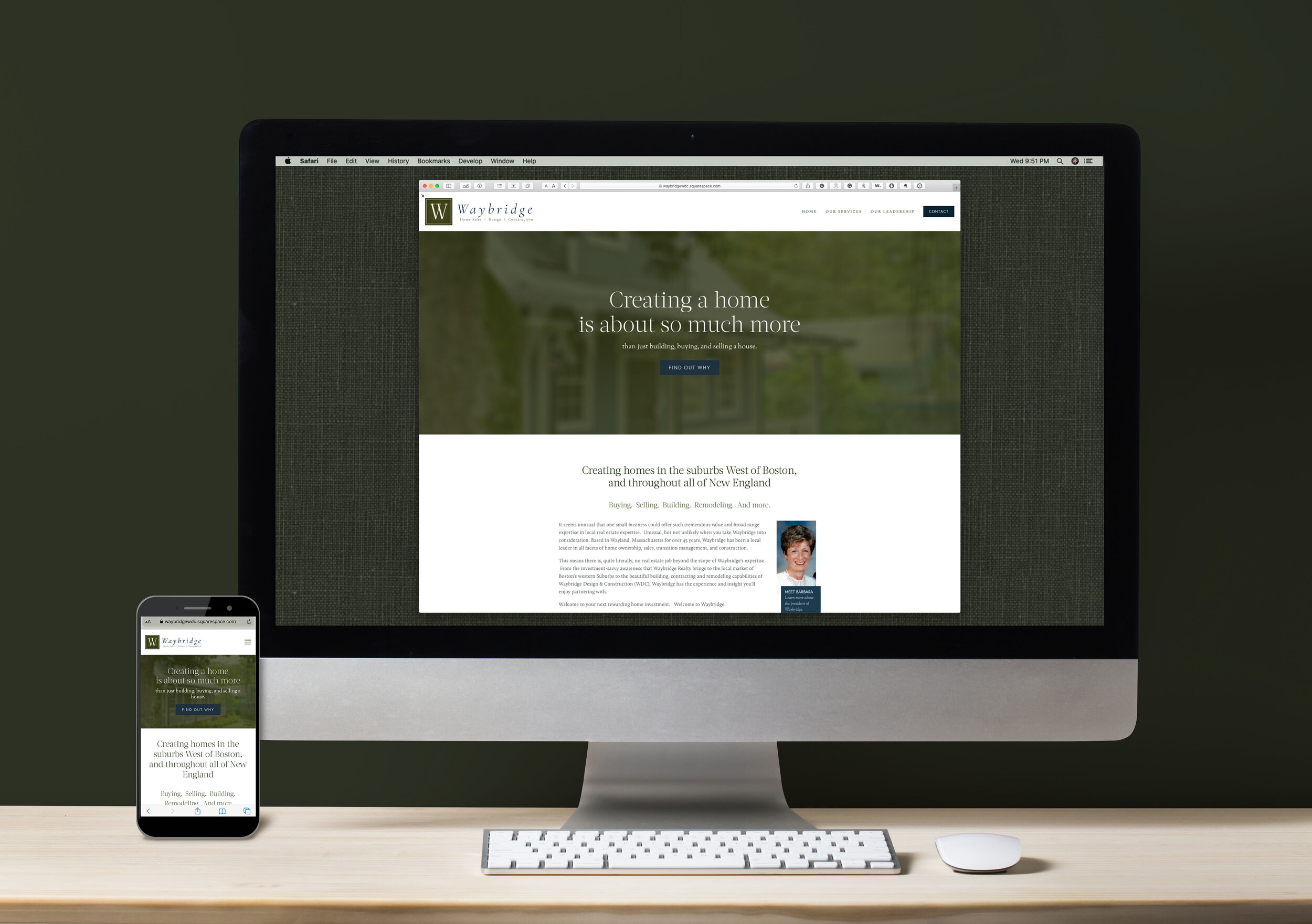
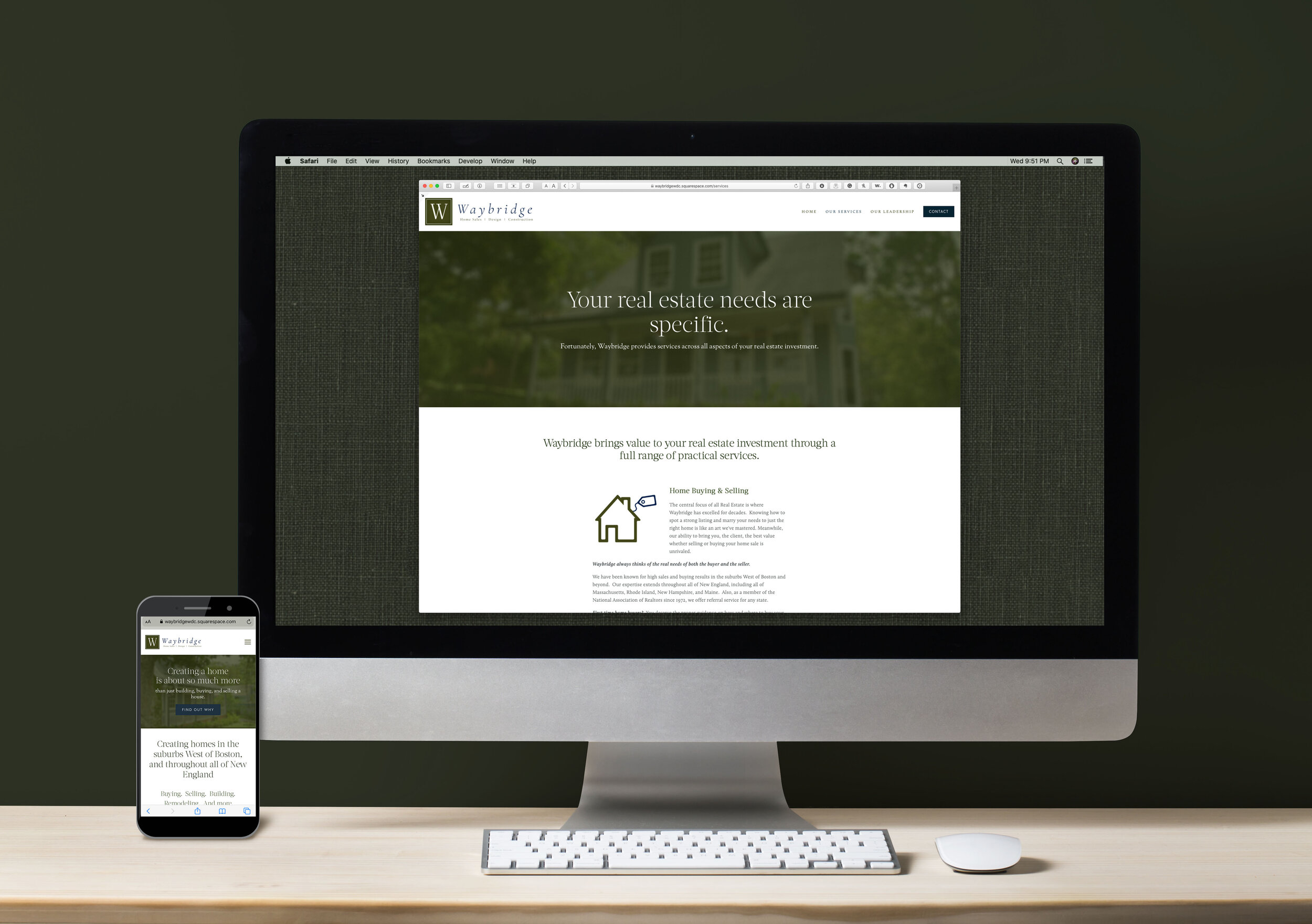
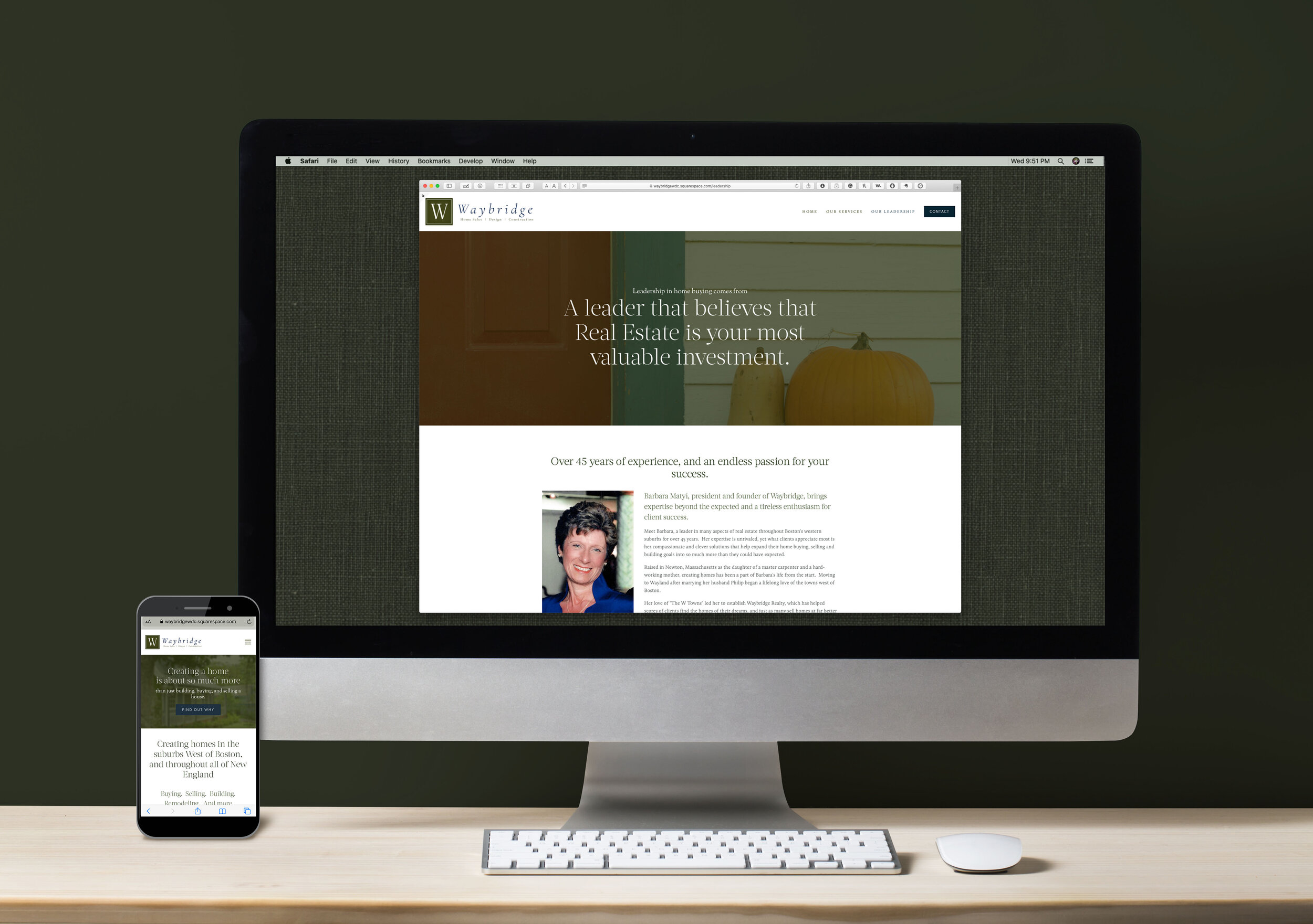
Waybridge Realty, Design & Construction website
With over 40 years continuous service in their market, Waybridge needed a website that was simple, direct and friendly to their suburban New England niche market while highlighting the incredible record of their founder.
Work included original graphics, photo retouch and compositing, brand development, copywriting, HTML & CSS, SEO optimization, client education, and other production.
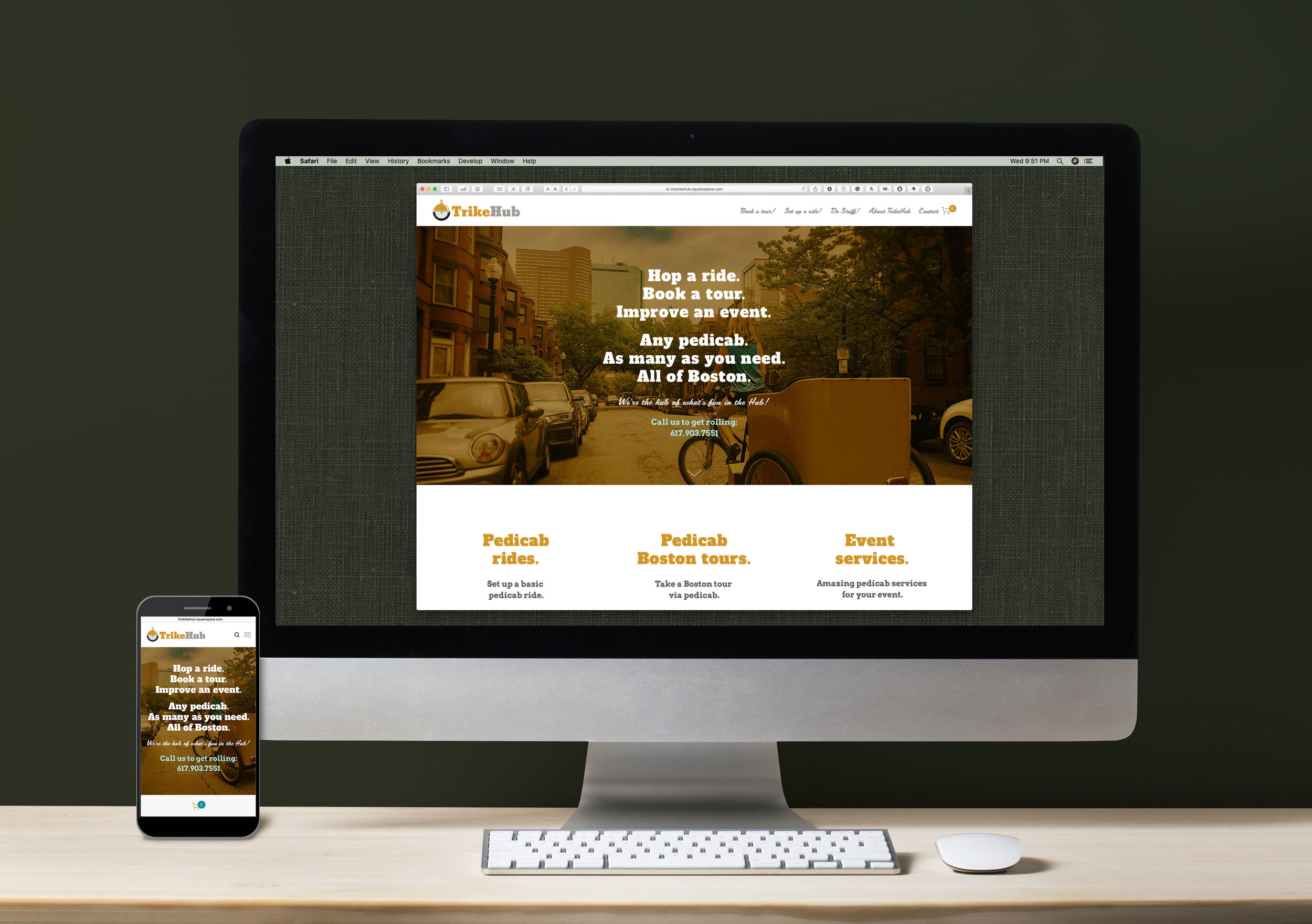
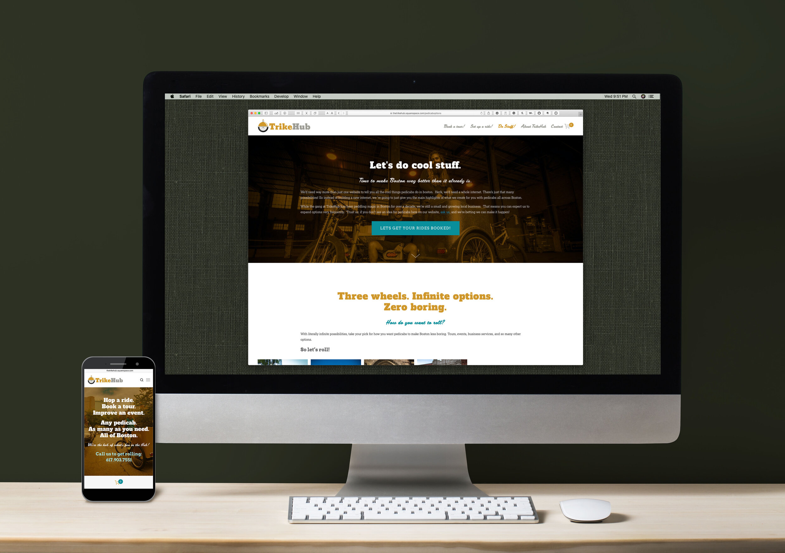
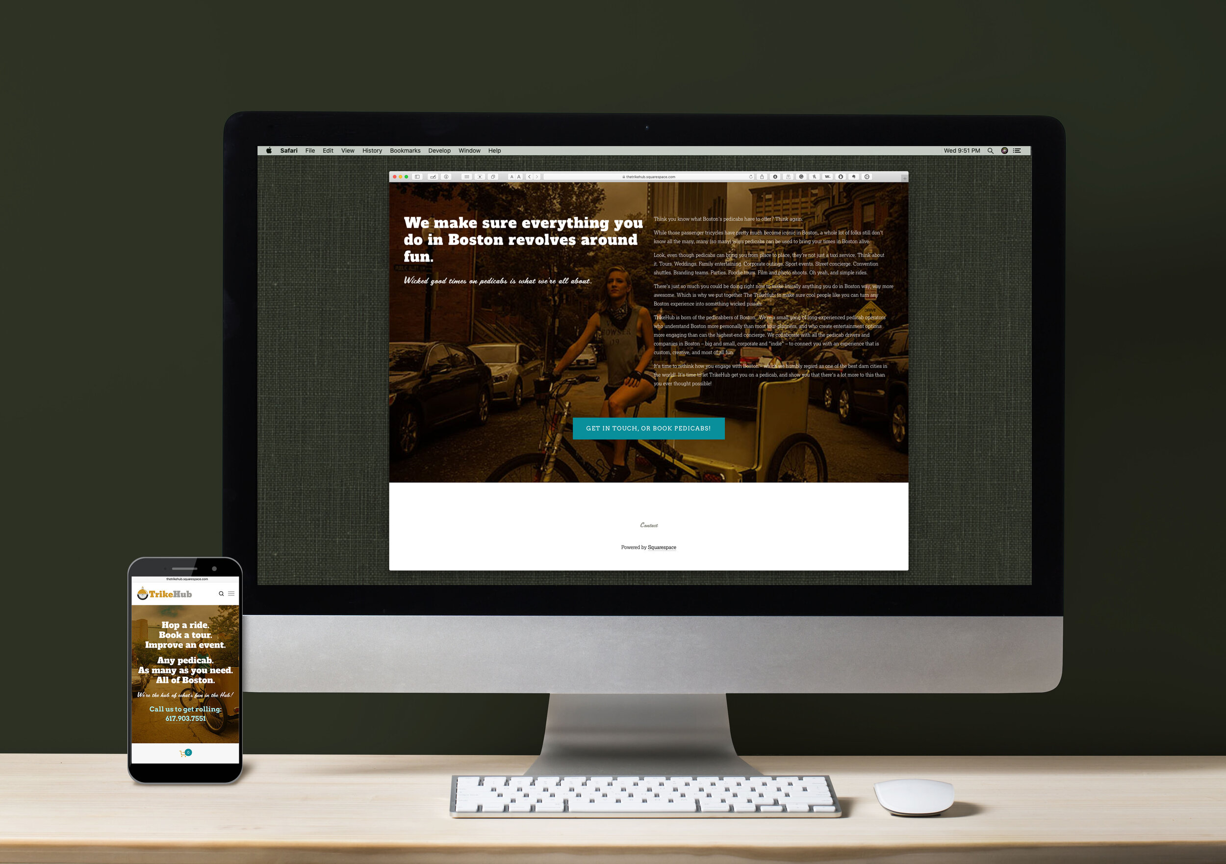
The TrikeHub Pedicab Services Website
A small company promoting and marketing pedicab entertainment, tours, and services in Boston needed online branding to describe their radically different take on a growing market while allowing them to expand their content as their enterprise grew.
Work included marketing strategy, original graphics, photography and photo library development, photo retouch and compositing, brand standardization, copywriting, information management, HTML & CSS, SEO optimization, and other production.
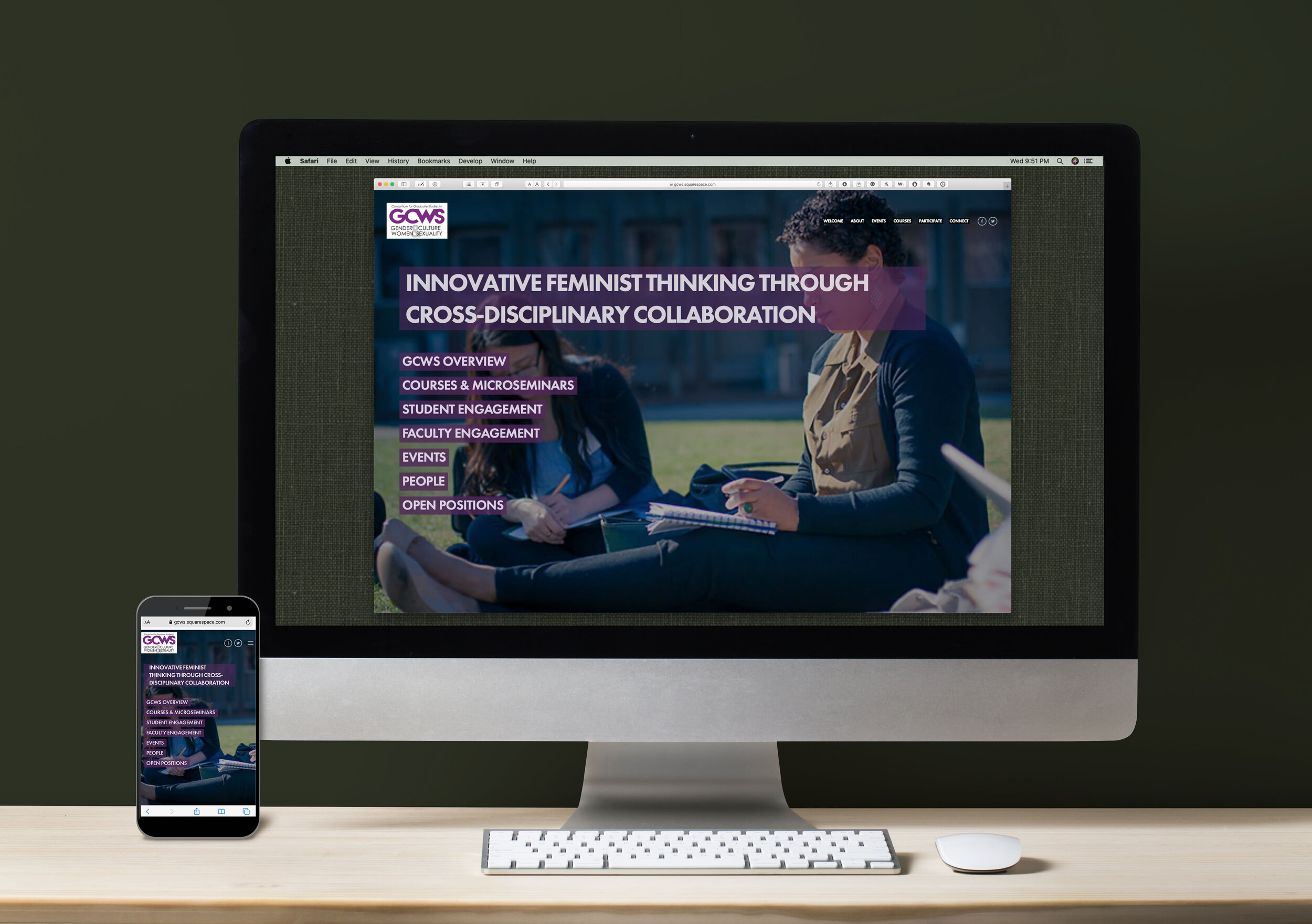
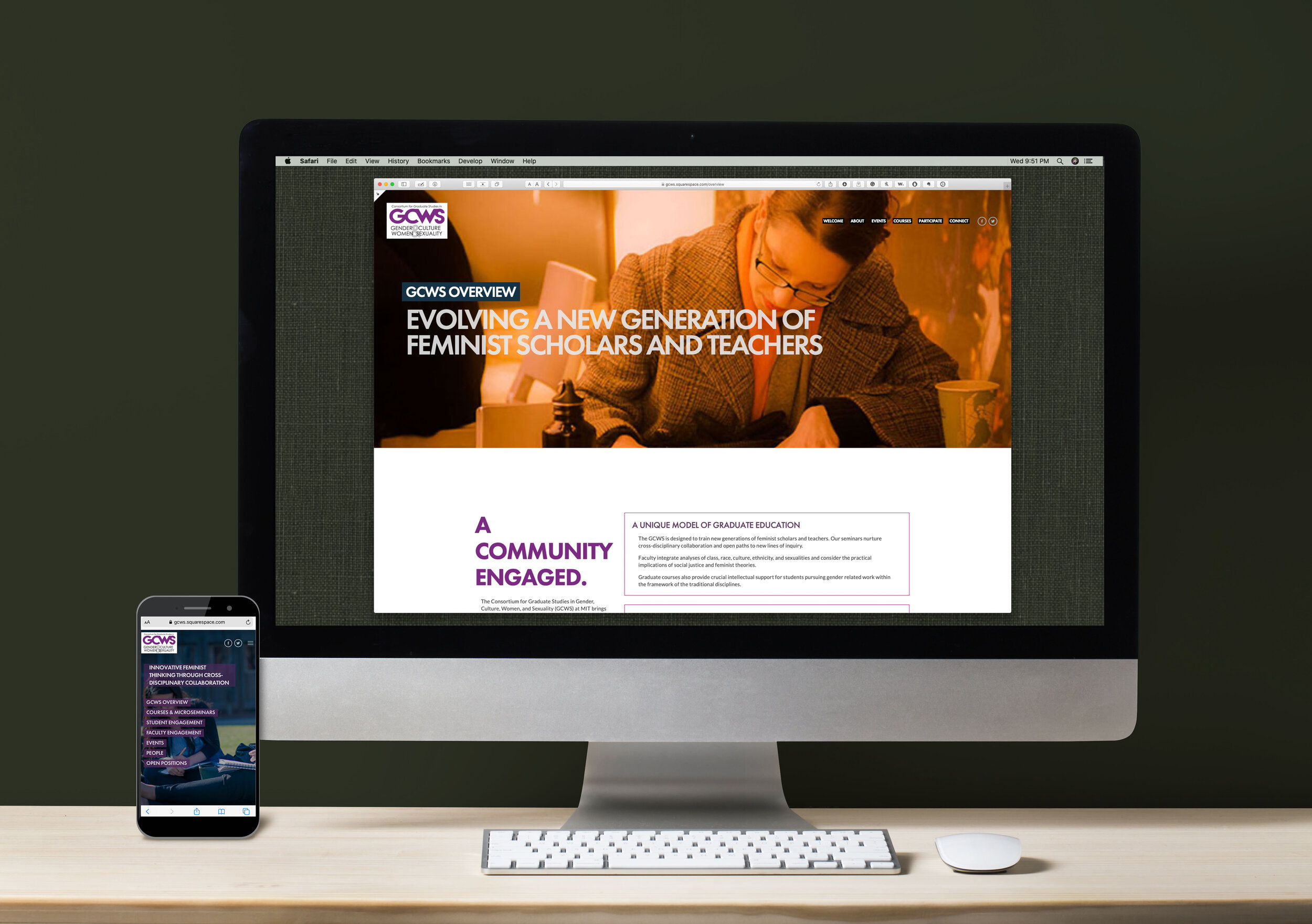
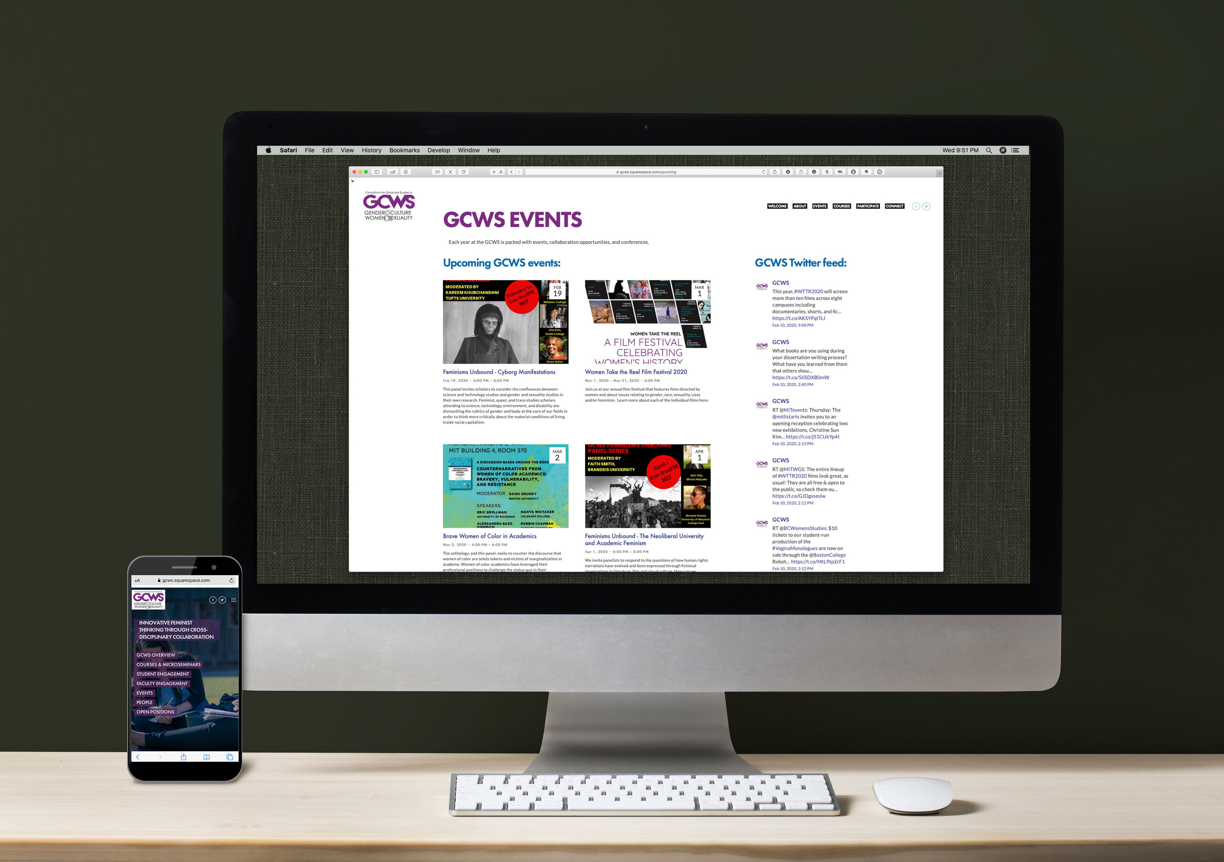
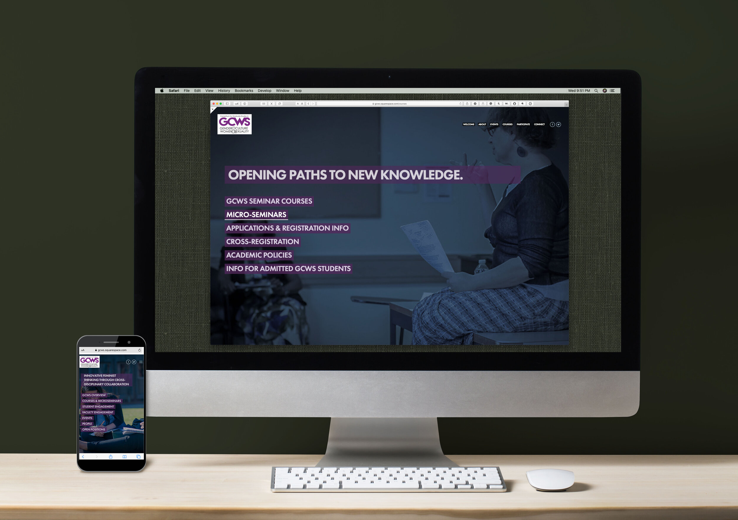
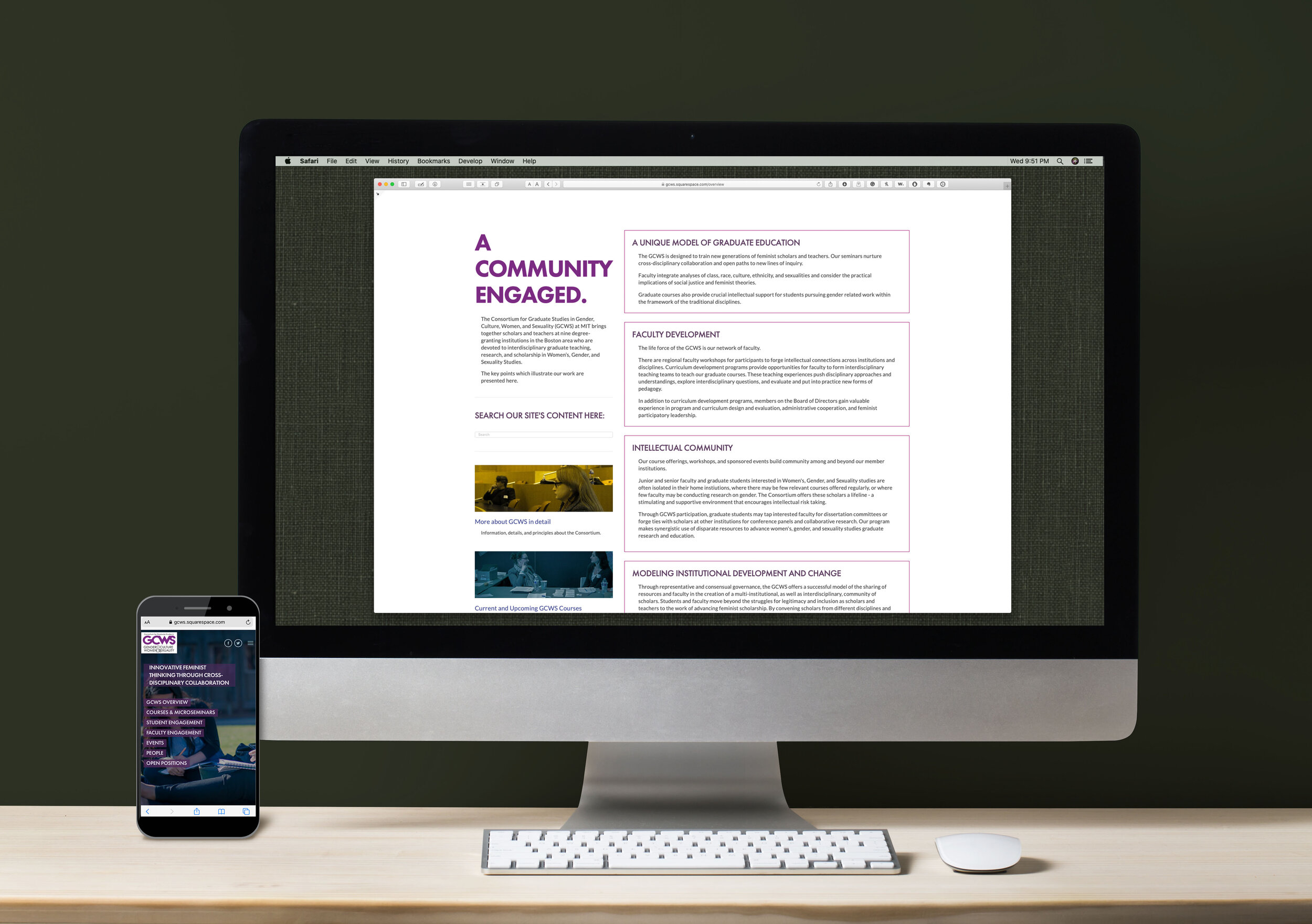
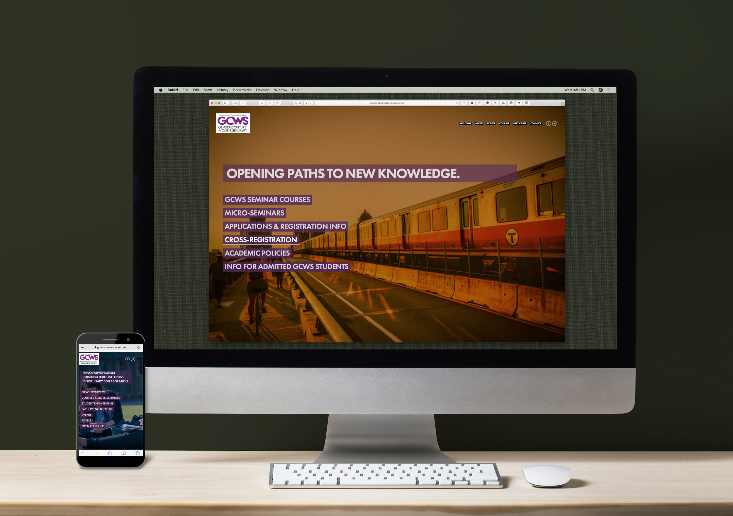
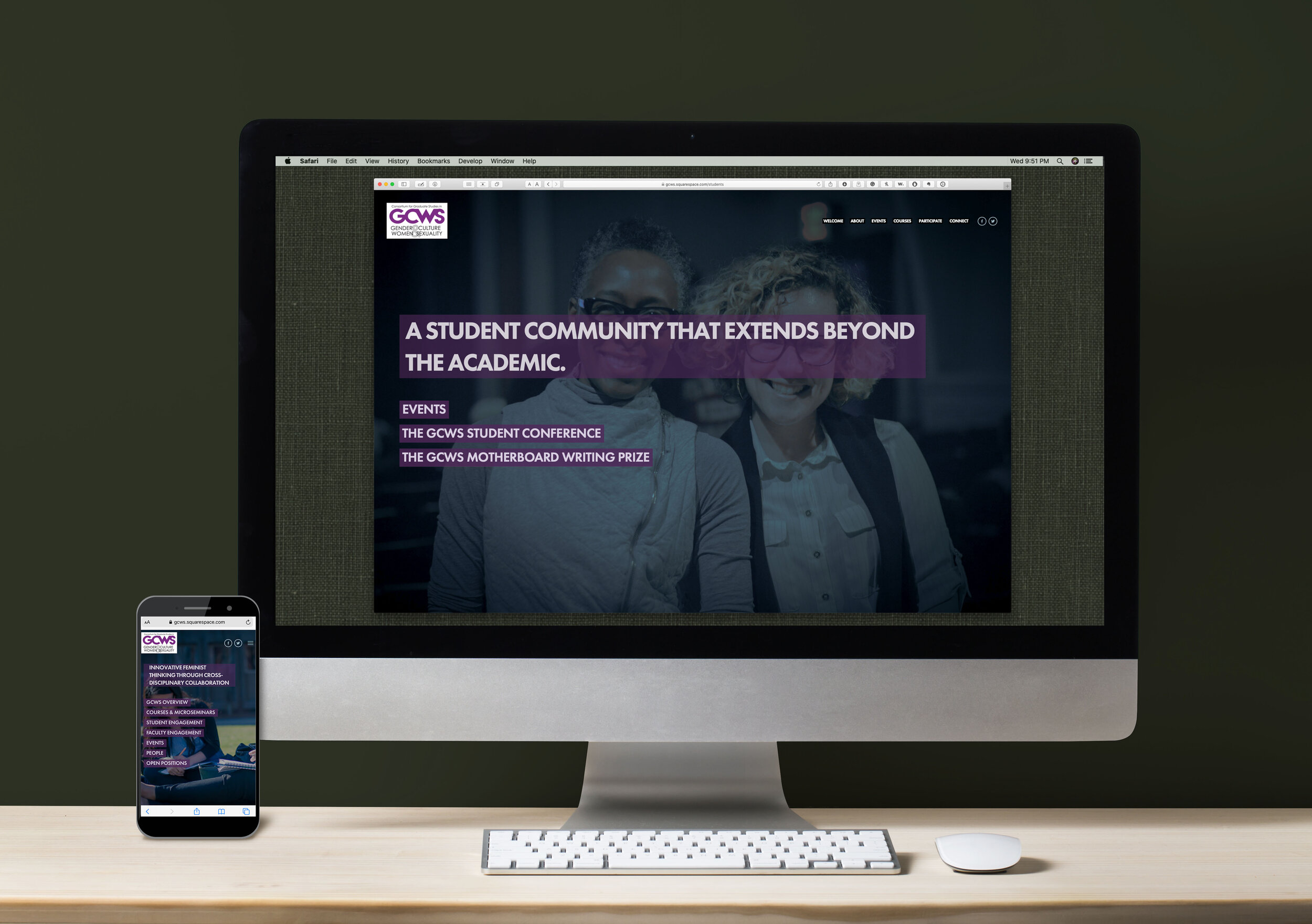
GCWS, An inter-collegiate Consortium Website
When the Boston area Graduate Consortium for Women’s Studies in Gender, Culture Women, and Sexuality (GCWS) sought to rebrand their growing academic entity they needed a website that communicated the power of their educational community while still feeling human and welcoming to current and prospective members. With mountains of information involved, they also needed ease of use for regular announcements and promotions.
Work included research into their niche, original graphics, photo retouch and compositing, brand standardization, copywriting, information management, HTML & CSS, SEO optimization, client education, and other production.
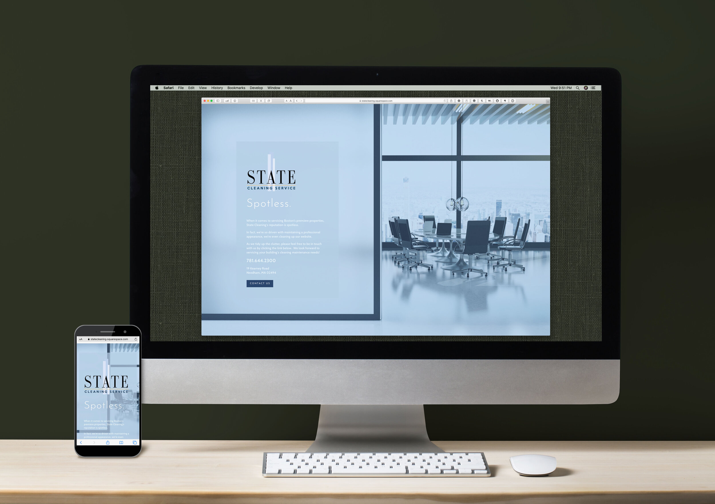
State Cleaning business placard
A simple project with a lot of impact, State Cleaning was a service business that rarely worked with clients outside of direct referral. As such, they needed a simple business card style web presence that explained their service yet maintained their exclusivity.
Work included photo retouch and compositing, copywriting, HTML & CSS, SEO optimization, client education, and other production.
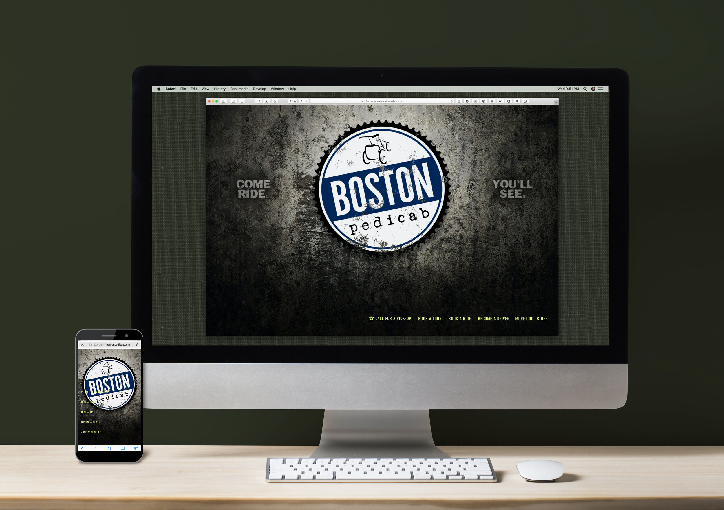
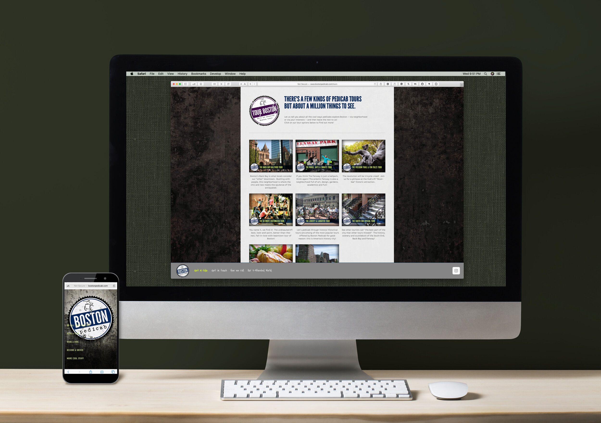
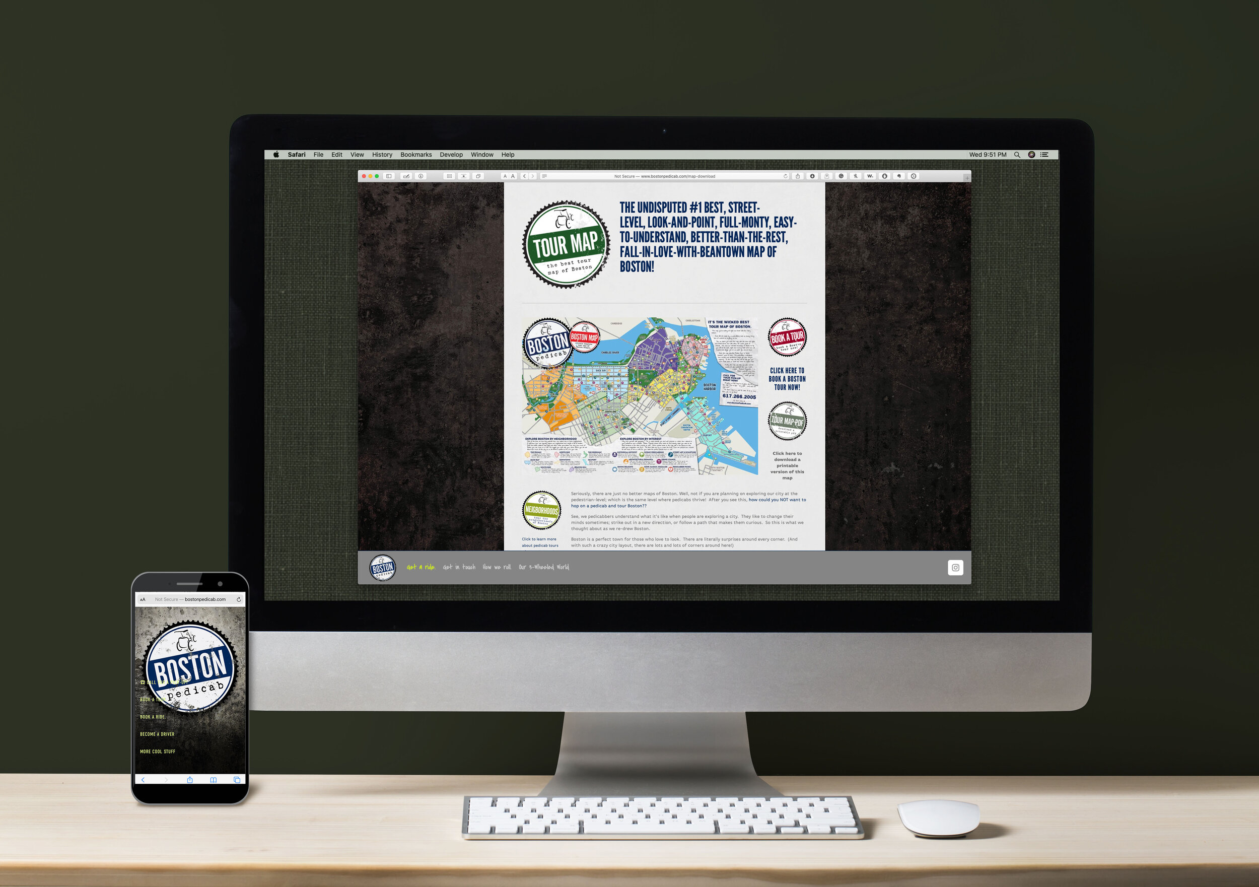
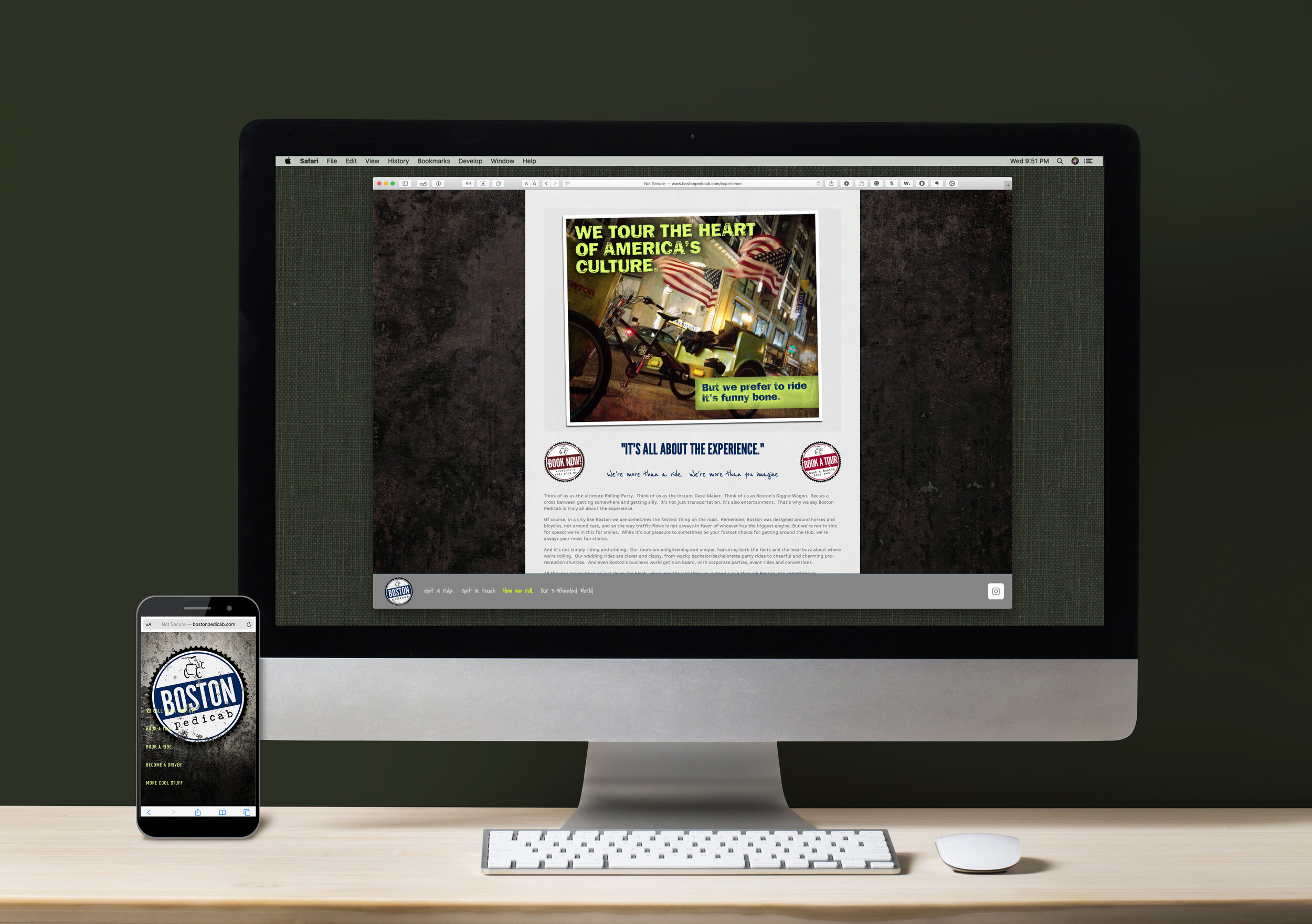
Boston Pedicab website
The flagship location of a major national brand, Boston pedicab’s website needed to be both functional as well as informative, allowing visitors to siphon into sales effectively. The brand had a strong establishment as a street-level, labor-class identity which had to be maintained while incorporating an air of fun and frivolity.
Work included original graphics, photography, photo retouch and compositing, brand standardization, copywriting, information management, HTML & CSS, SEO optimization, e-commerce, web services integrations, and other production.