DTA, Inc. branding
A small company at the forefront of big data needs big branding.
DTA, Inc. has been on the forefront of all aspects of data, and so needed branding as versatile as they are.
The branding of DTA, Inc. represents how the studio of Scorpio Creative can recreate a company’s creative collateral without obliterating past success.
You see, DTA, Inc. has been in the data technology game for a quarter century. Their greatest strength has been evolving with the times, always adapting their company’s services to the expanding needs of their clientele. So they needed branding that represented their adaptability, yet did not narrow how they are perceived into a box.
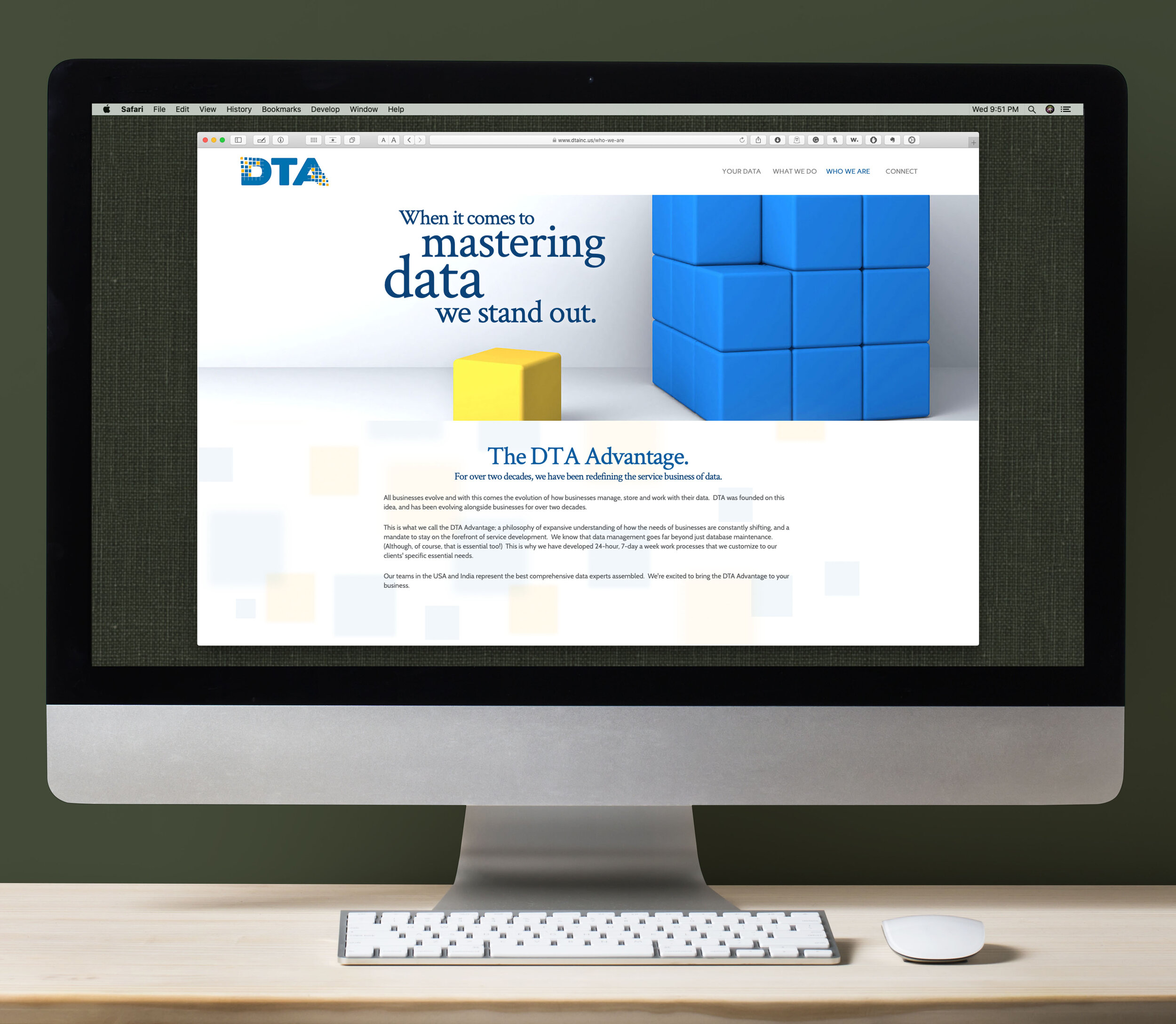
The box became the key. Borrowing an incidental element from an outdated sales sheet, Principal Creative Director Christian Matyi ran with the unlikely design element to create an entire brand theme for the company. it seemed impossible at first that a simple square could be expanded into communicating so much, but the theme was strong and gave new voice to a company that sought to communicate beyond expectations.
Engineers think linear, creative zigs and zags.
The core of DTA is innovation in engineering, form software to security to structure. The core of the company was applying the engineering mindset in creative ways to evolve new solutions for the clientele, based on real-application needs. But while there was a creative element baked right into the helm of DTA, there was still that pervasive engineering mindset that guided so much of their messaging.
Ensuring that the strong engineering capacities are not downplayed while adding human attitude was a creative bridge we crossed successfully. Adding elements that represent linear thinking yet still had angle and movement brought to life the hybrid of creativity and engineering DTA has build it’s reputation on.
Capacities utilized for this branding:
Brand standards.
Logo development.
Investigative education and comprehensive understanding of the client’s field.
Copywriting and establishing brand voice.
Website development.
Production of entirely original content.
Cooperative back-end collaboration with in-house team.
Photo compositing and retouching.
Print collateral and print management.
Identity collateral (business cards, letterhead, etc.)
Sales sheets and brochures.
Presentation graphics.
Trade show collateral.
Slideshow presentations.
Let’s get with the times: updating and rebuilding DTA’s outdated logo.
DTA, Inc. was the offshoot of enterprises begin in the late 1980’s. As such, many of their existing design elements were very much stuck in a styles that were outdated and made the brand look out of touch with the pace of present dat data technology. Their logo was the biggest representation of this problem.
Updating the DTA logo to something fresh while ensuring it can sustain a lifespan that will undoubtedly continue another decade or two was accomplished through simplification and boldness.

The old, original version of the DTA logo was a retro relic; hip for it’s time, but long overdue for an update that matched the current energy of the company.
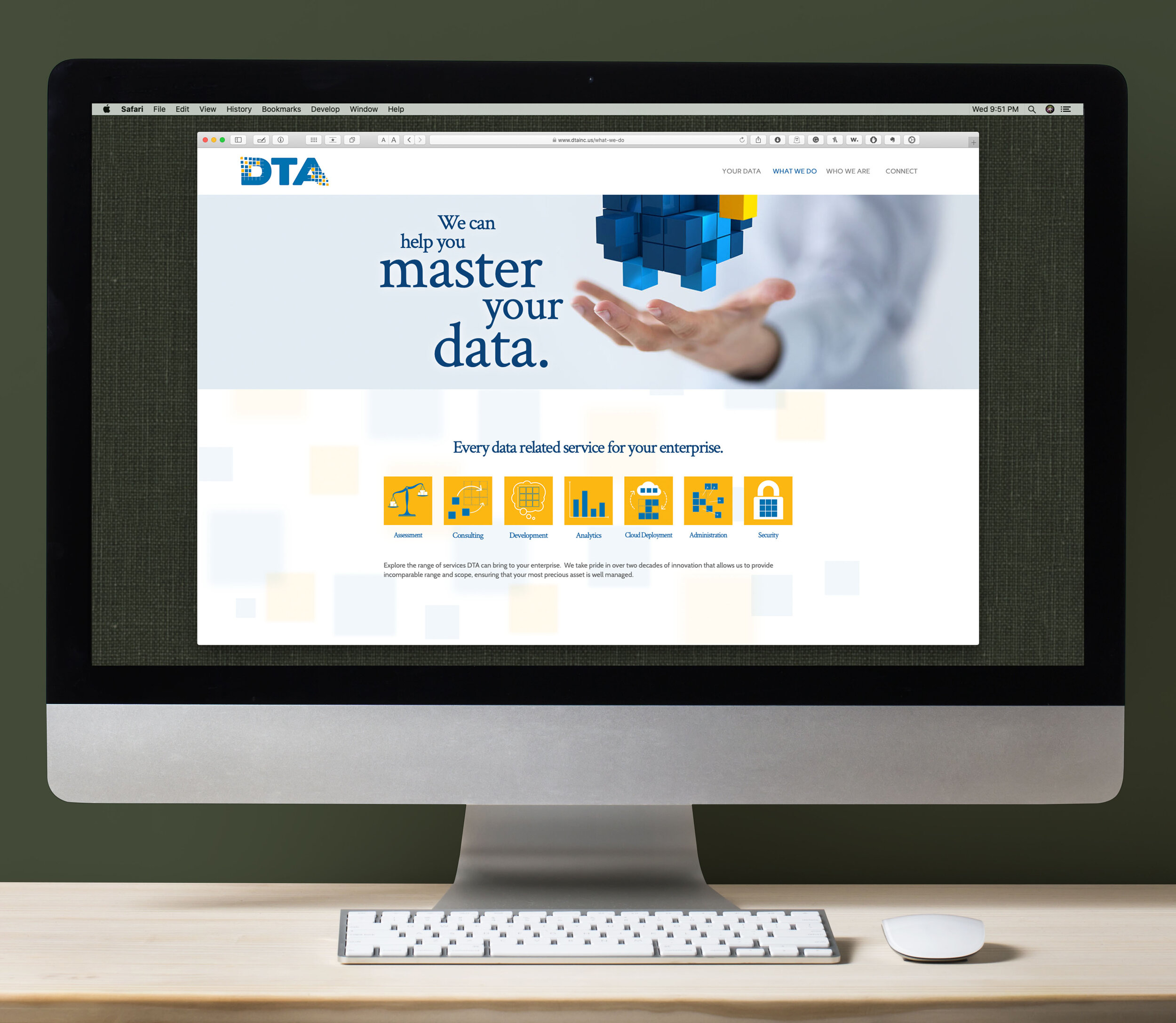
The new logo introduces the signature “data squares” (as we now have nicknamed them), adding motion and the idea of improvised assembly, which is a hallmark of DTA’s service.Contrasting hard corners with smooth edges allow for a softer, human element to contrast the starkness of the square shapes, implying the unity of creative human input with linear engineering aptitudes.
The vibrant colors were chosen with great care. DTA has bases in the USA and India, and had previously utilized India’s national colors of saffron yellow and teal-green to indicate the connection. We needed to keep a connection to the color scheme, but take on our own identity operate from Indian nationalism. We kept the saffron, tuning it up to be more vibrant, and then tinted the green more towards blue which was the result of carefully merging and finding the balance between the USA’s flag blue with India’s green. The colors now represent a globalized idea, and deepen the company’s creative lore.
Website recreation and rebuild: dances with engineers.
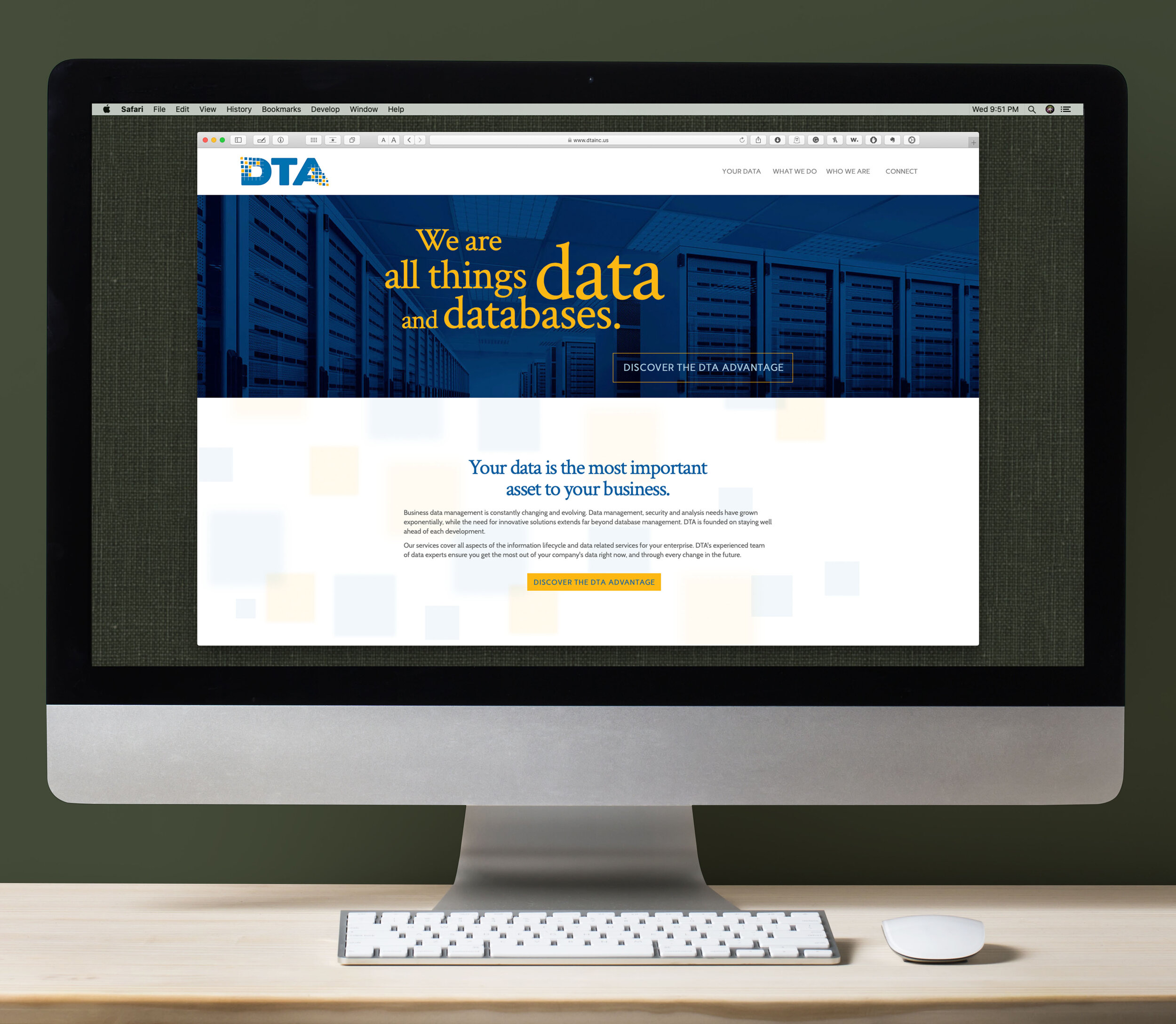
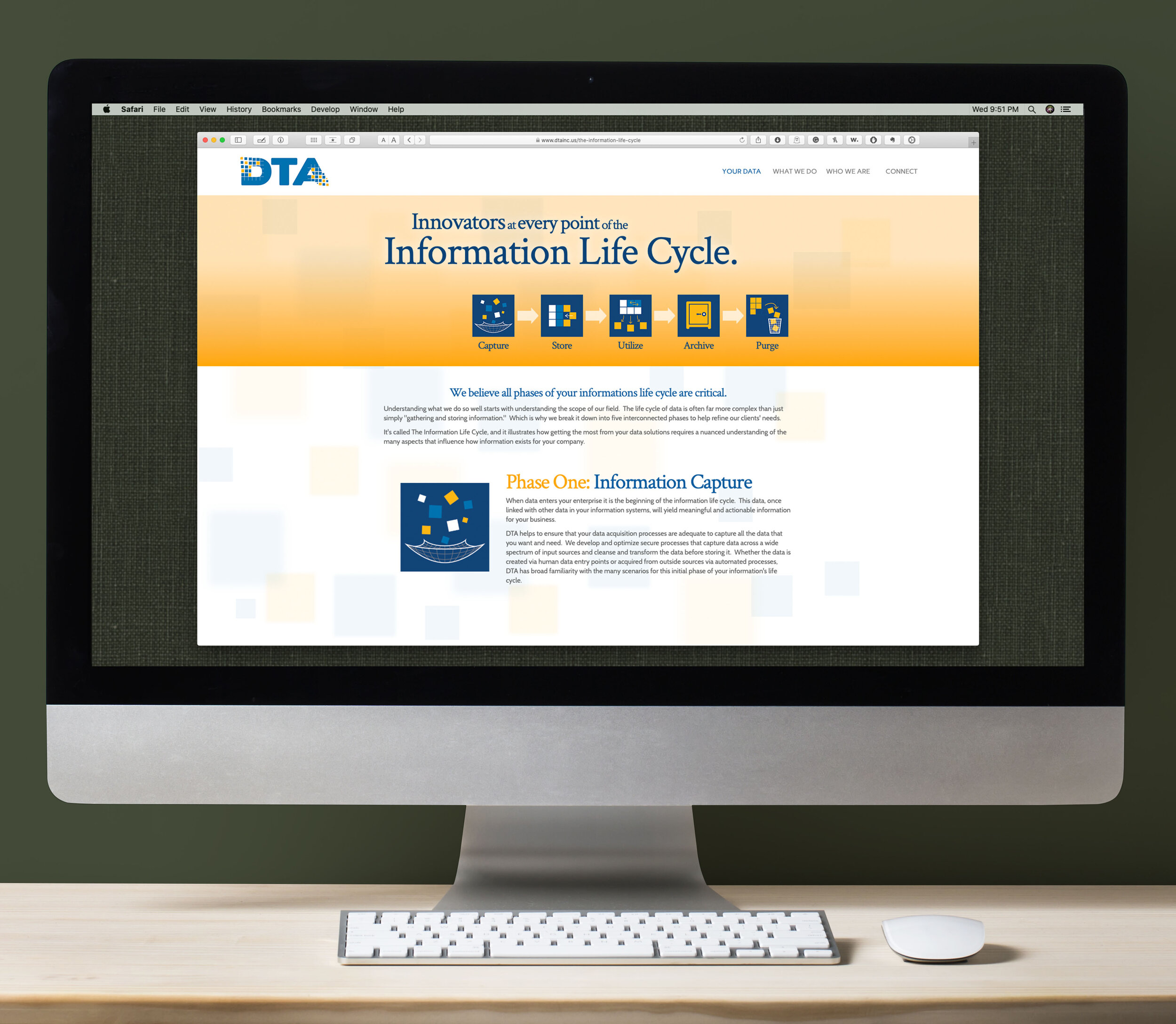
As with all the original collateral for DTA, the studio of Scorpio Creative not only faced outdated imagery and a tired, uninspired feel, but also faced the tricky tactic of bringing a human feel and liveliness to a business sector that is often, well, a little dry in it’s personality. Starting from a literal blank slate, Scorpio Creative developed an entirely new architectural hierarchy to the huge amount of information the company needed to present on it’s website.
Copywriting for a human touch
The key to the website’s success is the voice. Principal Creative Director Christian Matyi knew that words carry flavor, and so punctuated the website throughout with personalized tagline and a friendlier business tone to the copy. Meanwhile, moving the content away from cold, technical san-sharif font faces towards more human type added a humanity to the copy, as well as a pleasantness of engagement for the eye.
Architecture is a creative process.
The structure of information was a whole creative process unto itself. An insightful negotiation of information order yielded a far simpler tree of choices for the end user, which allowed complex ideas and multi-point explanations flow far smoother and cleaner. The structure of how information became presented allowed DTA to communicate it’s breadth of capacities far smoother and easier than in previous iterations, where users faced intimidating blocks of densely packed information.
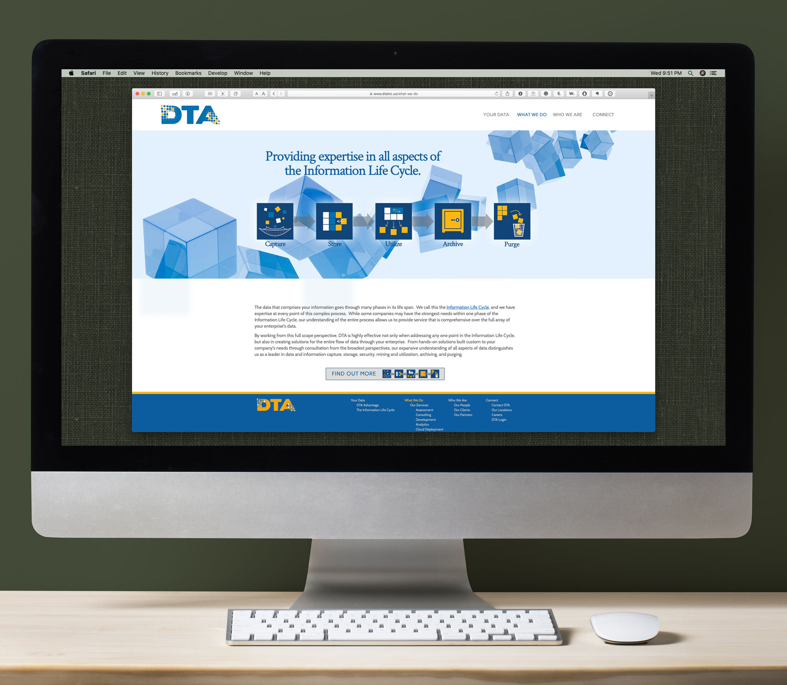
Designing a language of iconography
In the studio was created an entire library of customized icons which grounded the conceptual in familiar ideas. Utilizing the signature “data blocks” concept, suddenly there was clean visual representations the complex ideas behind data management and systems. The iconography also made the energy on the site lighter, undermining any stereotypes that engineers are stiff personalities while inferring that service and the human touch were at the core of DTA’s excellent performance history.
The iconic language crated for DTA curatively applied their “data block” concept to communicate many different data concepts.


COLLABORATIVE BACK-END
As programming is a specialty of DTA, the company presented a unique situation as a client for Scorpio Creative. They were able to do all the website back-end development on their end, which became a brilliant marriage of talent between the two firms. Freeing up Christian Matyi to do the true work of a Creative Director, he was able to innovate solutions more intuitively, without the burden of back-end structure to add static to his initial choices.
This arrangement also allowed the studio of Scorpio Creative to highlight one of their most valuable professional assets: the collaborative process. Smaller companies often require its members to have permeable responsibilities and roles, which is the environment Scorpio Creative has specialized its workflow towards. The ability to merge seamlessly as part of an already-established workflow team allowed the project to proceed with almost zero bugs, and robust communication among parties.
Creative collateral that carries the brand theme.
Essential creative collateral is a common component to any creative branding process. DTA’s letterhead and business cards married on theme with the rest of the rebrand.
Print layouts for sales sheets & brochures.
While so much of DTA’s business relies on virtual expertise, they pride themselves on client relations and direct service. Printed sales sheets are still a tool they use to bridge the virtual world with the hands-on reality of their work. The Studio of Scorpio Creative is thus called upon for traditional layout and design strategy, to create these vital sales and promotional tools.

